UESPWiki:Featured Images/Past Nominations
| Featured Articles | FA Gallery | Past FA Nominations | | | Featured Images | FI Gallery | Past FI Nominations |
This is an archive of past nominations for Featured Images.
| Page Archives
|
|---|
| Archive 1: Apr-Jun 2011 |
| Archive 2: Jun 2011-Oct 2012 |
| Archive 3: Nov 2012-Jun 2013 |
| Archive 4: July 2013-Dec 2013 |
| Archive 5: Dec 2013-Nov 2014 |
| Archive 6: Dec 2014-Aug 2015 |
| Archive 7: Sep 2015-Aug 2018 |
| Archive 8: Aug 2018-Jul 2020 |
| Archive 9: Aug 2020-Jun 2022 |
Contents
- 1 ON-quest-Half-Formed Understandings.jpg
- 2 ON-creature-Primordial Shattered Titan.jpg
- 3 SR-flora-Aloe Vera.jpg
- 4 ON-npc-Meridia.jpg
- 5 ON-creature-Cell Haunter.jpg
- 6 ON-place-Vivec's Antlers Land-Coral.jpg
- 7 ON-place-The Boatman's Tail.jpg
- 8 ON-creature-Frost Atronach.jpg
- 9 File:ON-quest-A_Special_Request.jpg
- 10 File:ON-npc-Khal H. Hughez.jpg
- 11 File:ON-interior-Klathzgar 05.jpg
- 12 File:ON-skill-Fiery Breath.jpg
- 13 File:SI-quest-The End of Order 2.jpg
- 14 File:SI-interior-Ebrocca, Masse.jpg
- 15 File:ON-quest-The Tower Sentinels.jpg
- 16 File:ON-activity-Lava Vent.jpg
- 17 File:SR-quest-Evil_in_Waiting_03.jpg
- 18 File:SR-npc-Rulnik Wind-Strider.jpg
- 19 File:ON-npc-Dosu-Zeeus.jpg
- 20 File:AR-npc-Smith.jpg
- 21 File:ON-place-Nobles District 02.jpg
- 22 File:ON-interior-The Mooring.jpg
ON-quest-Half-Formed Understandings.jpg[edit]
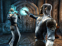
This is a nicely timed and framed shot showcasing an very important moment in lore, which is the confrontation between Vanus Galerion and Mannimarco on Artaeum.
- Support: As nominator Analeah Oaksong (talk) 02:30, 22 September 2024 (UTC)
- Support: Very cinematic, I am surprised it was not nominated previously.--Talyyn (talk) 06:00, 24 September 2024 (UTC)
- Support: Great framing. —Legoless (talk) 08:39, 24 September 2024 (UTC)
- Support: Very dynamic! Tarponpet (talk) 02:57, 25 September 2024 (UTC)
- Support: Good angle, good timing, good picture.Blowthemandown (talk) 03:26, 29 September 2024 (UTC)
ON-creature-Primordial Shattered Titan.jpg[edit]
- Support: As nominator; the lighting in this is fantastic! The Rim of the Sky (talk) 21:23, 22 June 2024 (UTC)
- Support: Good full body shot of a mysterious-looking creature. Gives off Bioshock vibes. —Dillonn241 (talk) 23:00, 29 June 2024 (UTC)
- Support: Magnificent!--Draugluin (talk) 12:19, 1 July 2024 (UTC)
- Support:Very cool guy. Hard to get nice shots of glass creatures.Tarponpet (talk) 02:57, 25 September 2024 (UTC)
- Support: Cool pic, the dark guy stands out against the bright background.Blowthemandown (talk) 17:22, 28 September 2024 (UTC)
SR-flora-Aloe Vera.jpg[edit]
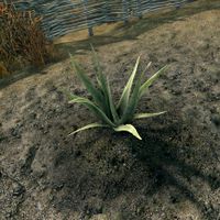
A clear, high quality screenshot of an obscure new addition to Skyrim SE. Not only is it a good image, but it draws attention to our continued high-quality game coverage in the Skyrim namespace.
- Support: As nominator. —Legoless (talk) 23:09, 15 March 2024 (UTC)
- Weak Support: A fantastic shot! My only concern is that the plant might blend in a little with the ground due to the similarity in color. —MolagBallet (talk) 17:55, 19 March 2024 (UTC)
- Support: Subtle and beautiful. The more I look at this image, the more I appreciate it.--Draugluin (talk) 07:26, 29 March 2024 (UTC)
- Support: Looks edible. Not super exciting, but this is representative of a good percentage of images on the wiki, and probably the only plant image to ever be featured. —Dillonn241 (talk) 02:11, 13 June 2024 (UTC)
- Support: It was very funny that this was added to Skyrim randomly. More focus should be put on it.Tarponpet (talk) 02:57, 25 September 2024 (UTC)
ON-npc-Meridia.jpg[edit]
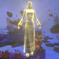
The fact that this image immediately draws the eye on any page it's put on is enough to convince me that this is a fitting pick for FI. The brilliant golden light makes her the focal point against that blue and violet background (the latter of which directly contrasts the yellow), which is just subdued enough to not be fighting with her for your attention. That color contrast and the difference in lighting between the foreground and the back is what transforms a potentially boring pick into an appealing one. The theming also helps: you spend the main story trudging through the oppressive blue and black wastelands of Coldharbour, and are suddenly thrust into the violet void at the end of it all, welcomed by the inviting glow of a warm color for once.
My only reservation is that her physical manifestation in the base game is a little "boring" as far as Daedric Princes go, but they went hard with the shaders: that glorious golden glow really picks this design up and jacks the visual appeal of the composition skyward. For as simple a design as "take a human model and slap a shader on it" is, Meridia quite literally lights up any shot you take of her in ESO: I can't think of a single image I've seen of her that doesn't hold my attention for at least a few seconds. It's very difficult to resist the urge to hit the "take screenshot" keybind whenever she's on-screen because she's an incredibly photogenic subject.
- Support: As nominator. --MolagBallet (talk) 05:09, 25 January 2024 (UTC)
- Oppose: It's still a little low-resolution, even after being reshot. Look at the facial detail. —Legoless (talk) 13:26, 30 January 2024 (UTC)
- Oppose: It's a yellow lady. The background is more interesting than the subject.Blowthemandown (talk) 18:00, 26 April 2024 (UTC)
- Oppose: Agreed with the above. The generic humanoid Daedric Princes from ESO are underwhelming. —Dillonn241 (talk) 02:11, 13 June 2024 (UTC)
- Oppose: Its pretty generic looking.--Analeah Oaksong (talk) 02:56, 25 September 2024 (UTC)
ON-creature-Cell Haunter.jpg[edit]
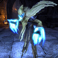
This is a really solid creature image. This shot takes the idea that the subject must be centered to a whole new level by having the Cell Haunter take up most of the frame. The negative space around the wraith makes this work: Cell Haunter is clearly defined against the darkness of the hall behind it, and the glorious glow beneath its rags contrasts beautifully with the darkness of its face and the drabness of its tunic. I'm a little concerned the strips of cloth at the very bottom of the photo being cut off at the very tip might affect how others see it, but I can ignore that in favor of the stellar composition it brings to the table. The angle the subject is at, the tilt of its head to view the photographer, and pose make for a very dramatic image with that glow.
- Support: As nominator. -MolagBallet (talk) 20:12, 23 January 2024 (UTC)
- Support: Good lighting, color, and use of space. —Dillonn241 (talk) 04:26, 24 January 2024 (UTC)
- Support: Cool shot! The Rim of the Sky (talk) 19:41, 24 January 2024 (UTC)
- Support: An interesting monster, in a good pose.Blowthemandown (talk) 05:44, 25 January 2024 (UTC)
- Comment: It's a good shot, but if we were to feature any wraith image I would much prefer File:ON-creature-Wraith 02.jpg. —Legoless (talk) 13:23, 30 January 2024 (UTC)
- Comment: Honestly, the candidacy for this nomination was a fierce competition between Wraith 02 and Cell Haunter, and it was a difficult choice. I'm glad we agree on the quality of that image! -MolagBallet (talk) 19:42, 30 January 2024 (UTC)
- Support: Love the pose!--Draugluin (talk) 10:58, 6 May 2024 (UTC)
ON-place-Vivec's Antlers Land-Coral.jpg[edit]
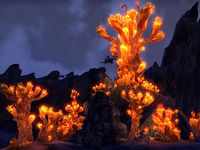
This is an excellent landscape image, with really fantastic lighting. The composition includes one prominent piece of coral which draws the eye.
- Support: As nominator. --AKB Talk Cont Mail 16:54, 12 January 2024 (UTC)
- Support: Very good lighting. The Dreugh give a sense of scale.Blowthemandown (talk) 17:19, 13 January 2024 (UTC)
- Support: A great shot of a great location.--Draugluin (talk) 10:11, 14 January 2024 (UTC)
- Support: Wonderful contrast between hot and cold colors and a clear delineation between the background and the foreground: bioluminescent fauna always makes for an exceptional subject, and this image displays the majesty of the locale's defining residents wonderfully. -MolagBallet (talk) 02:49, 18 January 2024 (UTC)
- Support: Nice contrast --Weroj (talk) 15:21, 23 January 2024 (UTC)
- Neutral: I feel that the contrast is maybe too strong and that the angle could have been better. It already effectively passed nomination, so I won't lean for or against it. —Dillonn241 (talk) 04:26, 24 January 2024 (UTC)
ON-place-The Boatman's Tail.jpg[edit]
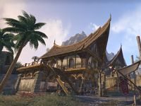
A high-quality place image. Shows off the location well and with great framing.
- Support: As nominator. —Legoless (talk) 11:30, 5 April 2023 (UTC)
- Support: Base game eso looks so good when the sun is actually out The Rim of the Sky (talk) 18:29, 21 June 2023 (UTC)
- Support: Very beautiful, makes me wish we could control time and place and have free camera in ESO. --AKB Talk Cont Mail 00:04, 23 December 2023 (UTC)
- Support: There is an argonian player in the background I believe, but they are not present in a way that distracts from the image. The shot itself is well framed and looks good for a base game screenshot.--Zebendal (talk) 02:49, 23 December 2023 (UTC)
- Support: Looks cool and is well framed --Weroj (talk) 15:21, 23 January 2024 (UTC)
- Support: I always liked these houses and the overall feel of Khenarthi's Roost. The angle, although forced to be like that, adds to the curvature of the roof. —Dillonn241 (talk) 04:26, 24 January 2024 (UTC)
- Oppose: It's a nice shot, but not one I find particularly remarkable. I'm glad people like it, though: before the nomination, I considered replacing it because I didn't like the angle, but if people like it, then that's one less thing on the invisible checklist. -MolagBallet (talk) 19:14, 27 January 2024 (UTC)
ON-creature-Frost Atronach.jpg[edit]
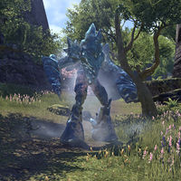
A clear shot of an interesting-looking monster, with good color contrast. As a bonus, it shows off the atronach's transparency.
- Support: As nominator.Blowthemandown (talk) 22:22, 25 July 2022 (UTC)
- Oppose: It's a great image that meets standards, but there's nothing that personally makes it stand out as an exemplary image. -MolagBallet (talk) 19:38, 5 October 2023 (UTC)
- Oppose: It doesn't stand out enough. --AKB Talk Cont Mail 00:04, 23 December 2023 (UTC)
- Oppose: Doesn't wow me. Can easily be retaken with a higher picture size.--Zebendal (talk) 00:14, 23 December 2023 (UTC)
- Oppose: This seems like a generic creature photo, and I don't agree about the contrast. —Dillonn241 (talk) 04:26, 24 January 2024 (UTC)
- Weak Oppose: Not a bad photo, but nothing special enough to be featured. Plus, compared to File:SR-creature-Frost Atronach.jpg, this image is not as imposing in its composition. The Rim of the Sky (talk) 19:41, 24 January 2024 (UTC)
File:ON-quest-A_Special_Request.jpg[edit]
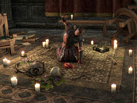
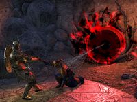
Count Carolus staining his good carpet. An important plot event in the DLC plotline, and one of the better instances of the Black Sacrament in-game.
- Support: As nominator.Blowthemandown (talk) 02:50, 29 November 2023 (UTC)
- Support: Pretty dynamic and the lighting is just right. --Talyyn (talk) 09:54, 29 November 2023 (UTC)
- Weak Support: I'm not a fan of the resolution or the UI particle effects emanating from that book. Otherwise a nice shot. —Legoless (talk) 10:35, 29 November 2023 (UTC)
- Oppose: The resolution is a bit too low, examining it I notice a lot of jaggies. --AKB Talk Cont Mail 00:04, 23 December 2023 (UTC)
- Oppose: Resolution should be higher. There is room for improvment for this image. --Zebendal (talk) 02:17, 23 December 2023 (UTC)
File:ON-npc-Khal H. Hughez.jpg[edit]
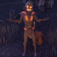
A well framed shot of a relatively rare holiday npc. Dark screenshots tend to look bad, but the dark background adds to the vibe of Witches Festival which is like Halloween, and the npc himself is mid emote and he is well lit himself.
- Support: As nominator.--Zebendal (talk) 04:13, 28 October 2023 (UTC)
- Support: I be poppin bottles 🤷🏿♂️ Sparkles and champagne 🍾 VIP my section, Royalty looking spooky 🎃 You know that be my bae The Rim of the Sky (talk) 04:59, 28 October 2023 (UTC)
- Support: Great screenshot, perfect pose, hard npc to catch. Definitely deserves the nomination.Tyrvarion (talk) 08:11, 28 October 2023 (UTC)
- Support: Interesting-looking character, interesting pose, and the orange lights pop against the dark background.Blowthemandown (talk) 22:46, 28 October 2023 (UTC)
- Support: A very goofy image captured, with its elements all working perfectly. --AKB Talk Cont Mail 00:04, 23 December 2023 (UTC)
- Support: Looks surprisingly good for TES, and as AKB mentioned, just the right amount of goofy. --Thefakewhitefang (talk) 05:34, 24 December 2023 (UTC)
File:ON-interior-Klathzgar 05.jpg[edit]
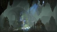
I'm quite fond of this shot of Klathzgar. It's atmospheric: the light pours in through a crack in the cavern's ceiling, illuminating the structure to the left and casting sublime shadows on the opposing face. The hanging vines and mild verdant growth surrounding the ruin make for quite a scene.
- Support: As nominator. -MolagBallet (talk) 20:33, 5 October 2023 (UTC)
- Oppose: Bad color composition, all gray-green. Also, the focus of the image is too off-center.Blowthemandown (talk) 00:08, 15 October 2023 (UTC)
- Support: This is a great image, very atmospheric and the composition creates an intriguing piece. --AKB Talk Cont Mail 00:04, 23 December 2023 (UTC)
- Support: Honestly a pretty good shot. Gives off an overgrown and abandoned vibe Dwemer ruins are known for. --Zebendal (talk) 02:17, 23 December 2023 (UTC)
- Support: What AKB said.--Draugluin (talk) 10:56, 23 December 2023 (UTC)
File:ON-skill-Fiery Breath.jpg[edit]
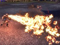
A Dragonknight class skill. Well timed, with good color contrast. I think SarthesArai even waited for dusk in order to light up the ground like that. It's absolutely delicious that they dressed the guy like the Dragonborn in Skyrim's promotional images, in order to show off this imitation-thu'um.
- Support: As nominator.Blowthemandown (talk) 00:04, 5 October 2023 (UTC)
- Oppose: It's difficult because I like this image: I think this is a perfect skill shot. Nobody will need to replace this one, for sure. But it doesn't cross the line to hit the wow factor for me. It's about the same issue I had with File:SR-npc-Rulnik Wind-Strider.jpg: great shot, love to see well-framed skill images, but it doesn't exceed my expectations. I do agree that the choice of costume is clever and the light level outside really elevates the flames. It's a model image, but not one that rises above the rest. -MolagBallet (talk) 20:33, 5 October 2023 (UTC)
- Oppose: It's a competent image, but it doesn't go above and beyond like we want for a featured image. --AKB Talk Cont Mail 00:04, 23 December 2023 (UTC)
- Oppose: I think Sarthes did a good job here. He even took the time to dress up the character. It just lacks that wow factor. --Zebendal (talk) 02:17, 23 December 2023 (UTC)
- Oppose: It's clever, but lacks the visual impact necessary for featured status.--Draugluin (talk) 10:55, 23 December 2023 (UTC)
File:SI-quest-The End of Order 2.jpg[edit]
A dynamic, expertly-timed picture of one of the most important plot events of the Shivering Isles, the appearance of Jyggalag.
- Support: As nominator.Blowthemandown (talk) 21:15, 17 May 2023 (UTC)
- Support —Legoless (talk) 16:26, 20 June 2023 (UTC)
- Support--Draugluin (talk) 04:34, 21 June 2023 (UTC)
- Weak Support: The scene captured is pretty great. Still, it suffers from the same problem as most pictures from 10+ years ago in that the resolution is too low, and as a result too blurry when closely looked at. I don't mind this for games like Redguard and Daggerfall where the resolution is inherently limited, but with current technology Oblivion does look much better in higher resolutions. If this picture could be retaken at the same shot I'd fully support it. There's a "freeze time" console command for Oblivion right? The Rim of the Sky (talk) 18:29, 21 June 2023 (UTC)
- Support: A fantastic image, deserves to be featured. It can be improved like Rim said by higher resolution, but I'm not aware of an actual method of pausing time in Oblivion. You could try to get lucky with the console menu pause itself, but that'd require careful editing out of the console commands. --AKB Talk Cont Mail 00:04, 23 December 2023 (UTC)
- Weak Support: What Rim of the Sky said. It's a good shot for its time, but it can be retaken at a better resolution. --Zebendal (talk) 02:17, 23 December 2023 (UTC)
File:SI-interior-Ebrocca, Masse.jpg[edit]
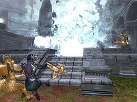
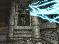
Woah, this pic goes hard. Sheogorath looks like he is in his ancient king mode in just the lower garment and crown and the timing of the trap shouting lighting is money. Love this picture, of this greatly designed statue, from this great dlc.
- Support: As nominator. Dcking20 (talk) 07:20, 17 April 2023 (UTC)
- Support: Strong central image & the detail on the stonework is very impressive. Also it's good to break up the long sequence of ESO images & show what the older games are capable of.--Draugluin (talk) 13:32, 20 June 2023 (UTC)
- Neutral: The rocky floor on the bottom takes too much space for me to fully support it. If the picture could be retaken slightly higher up with better resolution, to give us a better view of the lightning, I'd support it. The Rim of the Sky (talk) 18:29, 21 June 2023 (UTC)
- Oppose: The composition is too messy to deserve to be featured, in my opinion. --AKB Talk Cont Mail 00:04, 23 December 2023 (UTC)
- Oppose: The subject itself is neat. I think it has room for improvement by being taken at a higher resolution and with better framing.--Zebendal (talk) 02:49, 23 December 2023 (UTC)
File:ON-quest-The Tower Sentinels.jpg[edit]
This shot is very cinematic. The framing itself says a lot, just an all-around great scene captured in a perfect way.
- Support: As nominator. The Rim of the Sky (talk) 19:16, 22 October 2022 (UTC)
- Support: Very dynamic. Blowthemandown (talk) 17:09, 24 October 2022 (UTC)
- Support: Nice bit of storytelling. --Talyyn (talk) 03:25, 22 March 2023 (UTC)
- Support: Spectacular composition! -MolagBallet (talk) 17:25, 11 April 2023 (UTC)
- Support: Very cinematic, which is much more difficult to do with ESO. --AKB Talk Cont Mail 00:04, 23 December 2023 (UTC)
- Support: ESO doesn't have a pause button. Cinimatic shots like these are hard to get, and a moment sooner would have probably made this shot imporable. --Zebendal (talk) 00:11, 23 December 2023 (UTC)
File:ON-activity-Lava Vent.jpg[edit]
A very colourful action shot. Good contrast between the lava and the green jungle.
- Support: As nominator. —Legoless (talk) 22:21, 17 July 2022 (UTC)
- Support: Little guys up to some mischief The Rim of the Sky (talk) 00:51, 24 July 2022 (UTC)
- Support: Nice and dramatic.--Draugluin (talk) 04:35, 21 June 2023 (UTC)
- Support: This is a good image, deserves to be featured. Very nice contrast. --AKB Talk Cont Mail 00:04, 23 December 2023 (UTC)
- Weak Support: I think it's a pretty decent shot. Sure, it doesn't have that same world ending epic vibe that Volcanic Vents have, but Lava Vents are located in obscure locations and have a bit more rng to them to spawn, which makes finding them harder. --Zebendal (talk) 02:34, 23 December 2023 (UTC)
File:SR-quest-Evil_in_Waiting_03.jpg[edit]
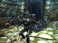
A Draugr Deathlord, a prominent boss monster in the game, unleashing the Thu'um. Well-lit, and expertly timed. The blood on the axe is a cherry on top.
- Support: As nominator. Blowthemandown (talk) 20:14, 30 November 2021 (UTC)
Weak Support: The blood took it over the top for me. If it could be retaken with higher graphical settings it would be greatly improved, though.--AKB Talk Cont Mail 16:10, 15 March 2022 (UTC)
- Weak Support: Exact-same sentiments as AKB— amazing shot, held back a bit by its graphical settings. If the subject popped from the background a bit more, and the textures weren't so "grainy", it would be perfect. —- Ingura (talk) 13:51, 13 July 2022 (UTC)
- Neutral: The pose is cool but the glare lighting up the ground takes me out of it, the other photos of this quest are much cooler imo. The Rim of the Sky (talk) 00:51, 24 July 2022 (UTC)
- Oppose: I think it would have been a great image at the time, but this image can easily be retaken in SE to be improved on.Zebendal (talk) 21:19, 22 March 2023 (UTC)
- Oppose: Agreed with the above. His foot is also clipping into the roots on the ground. -MolagBallet (talk) 20:36, 5 October 2023 (UTC)
File:SR-npc-Rulnik Wind-Strider.jpg[edit]
Nothing striking but this is a clear, well-lit NPC screenshot for Skyrim AE with a scenic background. Great to see this kind of quality still present in an older namespace.
- Support: As nominator. —Legoless (talk) 08:58, 1 April 2022 (UTC)
- Oppose: An unimportant NPC, in a neutral pose, against an uninteresting background. Not a lot to recommend. 173.49.208.25 04:46, 5 June 2022 (UTC)
- Neutral: It's a nice image, but there's nothing that makes it stand out as exemplary. On one hand, I'm not opposed to the idea of putting a good image that meets our standards to a T on display. On the other hand, it doesn't give me Feelings. It meets all of my expectations for an NPC image, but it doesn't make me say "woah" or "what a [insert adjective relevant to the mood of the shot here] composition". When I see this shot, I merely think "this is a good NPC image". I'm quite torn because I'm a sucker for good NPC images, and I wouldn't mind showing off something that embodies the essence of a good, clear shot (the lighting in particular is wonderful, showing us all the color of the scene unmarred, without altering the mood or obscuring the subject), but he is just standing there in a neutral pose. -MolagBallet (talk) 23:18, 18 June 2022 (UTC)
- Oppose: A combination of the above sentiments; though it's relatively well lit and decently readable, the idle A-pose is very uninteresting. If the character was instead caught mid-animation, it would bring a bit more intrigue. Alternatively, taking the image with a lower angle, to make the character look more imposing. A lower angle would also allow the legs to blend in less with the ground floor— the brown-heavy foreground would be remedied by bringing out more of the blues/greens in the distant mid/background. —- Ingura (talk) 13:51, 13 July 2022 (UTC)
- Oppose: No wow factor. I do appreciate Creation Club documentation however.Zebendal (talk) 21:19, 22 March 2023 (UTC)
File:ON-npc-Dosu-Zeeus.jpg[edit]
I may be a bit biased, as the current rendition was edited by me, but this image of Dosu-Zeeus looks fairly nice. Of all the NPCs I've taken in the zone, her idle animation makes her really stick out, and editing the image was a blast. It's also relatively well-lit, even before it was processed— taking good pictures in the Greymoor Caverns can be hard due to how dark it can be there.
- Support: As nominator. —- Ingura (talk) 13:51, 13 July 2022 (UTC)
- Oppose: It looks a bit blurry to me? —Legoless (talk) 09:31, 14 July 2022 (UTC)
- Oppose: Leagues better than what I took on my old hardware, but it's a bit blurry and the lighting overall is rather dark. -MolagBallet (talk) 18:00, 14 July 2022 (UTC)
- Comment: The blur was a consequence of anti-aliasing combined with lower sampling rate and bloom. I've reshot it, though the color balancing is fairly different now (as is the nature of editing in post). The shadows in the area are naturally dark, and in-game Dosu-Zeeus is spot-lit to be light at top and dark at bottom. Editing the values to be brighter leads to it looking washed out, so I brightened the focal point (waist-up) to make the details pop and her stand out from the background. Ultimately, though, I can ramp up the lighting overall, if that's preferred by the wiki. —- Ingura (talk) 01:36, 22 July 2022 (UTC)
- Oppose: Image was replaced mid-nomination -Damon talk ♥ edits 14:45, 23 July 2022 (UTC)
- Comment: Being replaced mid-nomination is NOT grounds for disqualification, see File:ON-misc-The Handfast.jpg. The Rim of the Sky (talk) 00:51, 24 July 2022 (UTC)
- Neutral: The lighting on the character is super cool but the background kind of ruins it for me. The Rim of the Sky (talk) 21:28, 12 November 2022 (UTC)
File:AR-npc-Smith.jpg[edit]
A striking retro image, recently improved for Lore:Smithing. The recent reupload is a serious improvement on the old version in terms of crop and resolution. This is the kind if quality I'd love to see for Arena screenshots.
- Support: As nominator. —Legoless (talk) 22:50, 21 March 2023 (UTC)
- Support: Lets have some Arena stuff featured. Looks nice.--Talyyn (talk) 03:25, 22 March 2023 (UTC)
- Support: I agree. It's always nice to see a proper, good quality screenshot from older games. Adds more variety to featured images.Tyrvarion (talk) 11:09, 22 March 2023 (UTC)
- Support: buff man, quite popular with fans The Rim of the Sky (talk) 19:28, 22 March 2023 (UTC)
- Support: This is a great shot, I agree with that.Zebendal (talk) 21:20, 22 March 2023 (UTC)
- Support: I can't believe this image isn't in 4K quality with the highest possible graphics an RTX 4000 series is capable of! Oh wait... Schiffy(Talk) 15:52, 31 March 2023 (UTC)
- Support: I love this image! Yes, let's show some love to Arena. Theolaa (talk) 04:41, 11 April 2023 (UTC)
File:ON-place-Nobles District 02.jpg[edit]
Dark Anchors are incredible focal points, and the Imperial City is not immune to that fact. Your eyes are drawn to the bright light imposed upon the dark frame, then down the neck of the Tower towards the devastation below. I think one way this could be improved is by taking a similar shot in another district, particularly one where Daedric Titans are visibly circling the Tower.
- Support: As nominator. -MolagBallet (talk) 00:48, 17 September 2021 (UTC)
- Comment: While this is indeed a good shot, I find it very similar in composition and coloring to The Mooring image nominated above. Makes me feel like I have to pick one or the other if I want to support one. — Wolfborn(Howl) 01:00, 18 September 2021 (UTC)
- Support Croaker (talk) 04:47, 11 November 2021 (UTC)
- Support: Hard to say no to a shot of White-Gold Tower The Rim of the Sky (talk) 21:13, 14 November 2021 (UTC)
- Support: Fantastic quality and subject. --AKB Talk Cont Mail 16:10, 15 March 2022 (UTC)
- Weak Support: Absolutely adore this shot. The only way it could look cooler is if the shot was taken a bit closer, so the pillar looks like it's penetrating the anchor's center. A slight counter-clockwise pan would also frame it better, as the gap in the buildings on the right is large enough to make the shot look a bit lopsided. —- Ingura (talk) 13:51, 13 July 2022 (UTC)
File:ON-interior-The Mooring.jpg[edit]
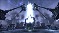
Because I cannot be stopped, I will be nominating more images. The framing on this shot is spectacular; I always stop to look at it whenever I pass it by.
- Support: As nominator. -MolagBallet (talk) 00:48, 17 September 2021 (UTC)
- Comment: While this is indeed a good shot, I find it very similar in composition and coloring to the Nobles District image nominated below. Makes me feel like I have to pick one or the other if I want to support one. — Wolfborn(Howl) 01:00, 18 September 2021 (UTC)
- Oppose: Per Wolfborn. Too similar to the Nobles District image, and I prefer the Nobles District image. Croaker (talk) 04:47, 11 November 2021 (UTC)
- Support: Great shot The Rim of the Sky (talk) 21:13, 14 November 2021 (UTC)
- Support: Fantastic quality and subject. --AKB Talk Cont Mail 16:10, 15 March 2022 (UTC)
- Oppose: I share similar sentiments to Wolfborn. A
very slightnitpick is the fact that it's not perfectly symmetrical— the chain bases at the sides of the frame are neither evenly cropped nor level with one another, and the central spires aren't symmetrical. (I will admit that the latter part is not necessarily a failing of the photographer, but its asymmetry would look better were everything else symmetrical.) If the camera angle were panned a bit more counter-clockwise, it would improve the framing by a decent margin. My eyes immediately gravitate to the obtuse angle made by the chains coming from the right base, and would love it shared with the other side or omitted entirely. —- Ingura (talk) 13:51, 13 July 2022 (UTC)
