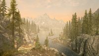
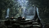
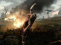
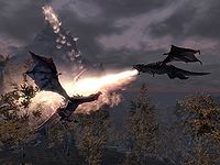
UESPWiki:Featured Images/Past Nominations/Archive 2
| This is an archive of past UESPWiki:Featured Images/Past Nominations discussions. Do not edit the contents of this page, except for maintenance such as updating links. |
This is an archive of past nominations for Feature Images from June 2011 to October 2012.
Contents
- 1 File:SR-creature-Skeleton.jpg
- 2 File:SR-quest-Missing In Action.jpg
- 3 File:SR-npc-Delphine 03.jpg
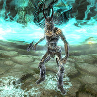
- 4 File:SR-npc-Fire Spirit.jpg
- 5 File:OB-creature-Brown Bear 02.jpg
- 6 File:SR-quest-Touching the Sky.jpg
- 7 File:SR-quest-Kindred Judgment.jpg
- 8 File:SR-quest-Bloodline.jpg
- 9 SR-quest-Pieces of the Past 08.jpg
- 10 File:SR-creature-Ice Wraith.jpg
- 11 File:SR-quest-Fight!_Fight!.jpg
- 12 File:SR-quest-The Only Cure 07.jpg
- 13 File:SR-place-Lake Ilinalta.jpg
- 14 File:SR-quest-Bleak Falls Barrow.jpg
- 15 SR-quest-Dragon Rising 05.jpg
- 16 File:SR-creature-Odahviing Battles Elder Dragon.jpg
- 17 File:SR-interior-Temple of Talos (Windhelm).jpg
- 18 File:SR-quest-Alduin's Bane 02.jpg
- 19 SR-place-Hall of Valor.jpg
- 20 OB-quest-A Brush with Death.jpg
- 21 SR-quest-Alduin's Bane.jpg
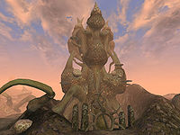
- 22 MW-place-Tel Naga.jpg
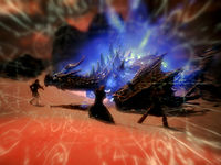
- 23 File:SR-creature-Blood_Dragon_Attack.jpg
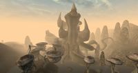
- 24 MW-place-Tel Mora.jpg
- 25 File:SR-quest-The Wolf Queen Awakened.jpg
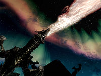
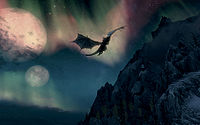
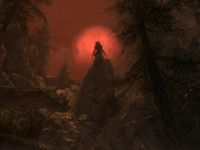
- 26 File:SR-photo-Dragon, Moons and Aurora.jpg
- 27 File:SR-quest-Forbidden Legend 10.jpg
- 28 File:SR-creature-Jyrik Gauldurson.jpg
- 29 File:SR-quest-Unbound2.jpg
- 30 The Battle For Solitude
- 31 File:SR-quest-Elder Knowledge.jpg
- 32 File:Snowysabrecat.jpg
- 33 Ill Met By Moonlight
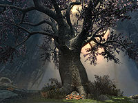
- 34 File:SR-place-Eldergleam.jpg
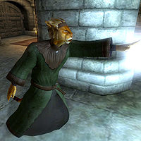
- 35 M'raaj-Dar
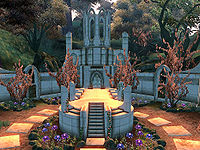
- 36 File:OB-quest-Paradise.jpg
- 37 MW-place-Akulakhan.jpg
- 38 SI-npc-Ciirta Confronted.jpg
- 39 File:OB-npc-Melus Petilius.jpg
- 40 File:OB-npc-Lucien_Lachance_3.jpg
- 41 File:OB-npc-Modreyn_Oreyn_Painting.jpg
- 42 File:MW-quest-Breeding Netch.jpg
- 43 File:SI-place-Door to Cyrodiil 02.jpg
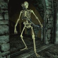
File:SR-creature-Skeleton.jpg
Well, I felt like continuing the streak of FI images that have been coming in. Here is one that I particularly like. Nice, cool looking angle that shows that this skeleton means business. Not a lot to say that the image doesn't say really.
- Support: Nominator Eric Snowmane(talk•email) 06:16, 16 October 2012 (GMT)
- Support: Bones, bones, bones! You know I'd be one for Necromancy... well not really. Issues in the past with Mannimarco really. Regardless of the fact that I'm totally opposed to any form of necromancy or the undead due to personal reasons, I do in fact love the slight angle of this image against the skeleton holding the bow and arrow -Helenaannevalentine(talk) 06:22, 16 October 2012 (GMT)
- Oppose: I love the skeletal archer, of course, but I think we can do better with the background. I'd hate to think that a similar image set in more impressive surroundings would be opposed due to the fact that this was already an FI. Also, while I love virtually everything about the angle, the archer almost looks one-legged, especially in the thumbnail. Minor EditsThreats•Evidence 14:41, 16 October 2012 (GMT)
- Oppose: It is undoubtedly a great angle, I do have some issues. I think that ME is right, and that the background is not optimal, though I would not have noticed it if it had not been pointed out. I also second ME's complaint about the leg, and would like to point out that in the thumb it almost looks like the skeleton has no legs, as the visible one blends in with the ground. Despite all of that, I desperately wanted to support this image, purely for the angle, and then I saw it. One of the most frequent graphical missteps in the whole of Skyrim: levitating quivers. That graphical flub is one which bugs me quite a bit every time I see it, and I cannot, in good conscience, play any part in allowing it to reach our front page. --HalfStache 22:07, 6 August 2012 (UTC) 23:43, 16 October 2012 (GMT)
- Oppose: I agree with what has been said. This is a great angle, but the background could be better, and the floating quiver is quite annoying. A different location, and a slightly different angle would do this picture wonders. • JAT 00:05, 17 October 2012 (GMT)
- Comment: I can see how it irks some people that the leg being partially obscured and less obvious is annoying now that I see that, but I am rather fond of that background. I like how the dark background contrasts against the lit up skeleton. Eric Snowmane(talk•email) 14:59, 17 October 2012 (GMT)
- Oppose: The only thing going for this image is the angle. Everything else is unremarkable. --Xyzzy Talk 04:13, 18 October 2012 (GMT)
- Oppose: There's way more this image has going against it than for it. Nothing special. — ABCface◥ 04:50, 18 October 2012 (GMT)
- Oppose: True, the contrast is gd betw the skeleton and the backgrd, but i think a slightly brighter backgrd can still achieve a gd contrast. A better angle cld be chosen to address that floating quiver issue.--Honeystars (talk) 09:37, 22 October 2012 (GMT)
- Oppose: The glowing, undead eyes of the skeleton are perfectly suited to a dark environment. A daytime shot doesn't do this enemy justice. —Legoless (talk) 18:27, 22 October 2012 (GMT)
CONSENSUS: Opposed (7 opposed to 2 support). --AKB Talk Cont Mail 15:29, 29 October 2012 (GMT)
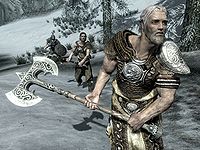
File:SR-quest-Missing In Action.jpg
I think this shot is awesome, and let me tell you why: lighting is perfect, great detail, perfect angle, perfect zoom, and sure, I'll throw in the popular "symbolism".
- Support: As nominator ~ Dwarfmp (talk) 22:17, 15 October 2012 (GMT)
- Support: Excellent shot. It looks awesome as thumbnail and at full size, for the reasons Dwarfmp listed above as well as the fact that, context-wise, it's a fantastic image for use on the related quest page. — ABCface◥ 22:51, 15 October 2012 (GMT)
- Support:I always liked that image. The angle is particularly oustanding.--Skyrimplayer (talk) 22:56, 15 October 2012 (GMT)
- Support: Excellent shot with excellent depth. --Krusty (talk) 23:38, 15 October 2012 (GMT)
- Support: I love the positioning of the NPC's in this shot, it's really well done and portrays well in it's depth. Plus the detail really does show up in the full-sized image also. --Helenaannevalentine(talk) 01:24, 16 October 2012 (GMT)
- Support: Just an all around great image --HalfStache 22:07, 6 August 2012 (UTC) 02:18, 16 October 2012 (GMT)
- Oppose: Equally unremarkable. It's silly that the Featured Article images are consistently much better than the actual Featured Images. Weroj (talk) 03:25, 16 October 2012 (GMT)
- Neutral: Meh. I like the detail, but the image doesn't really impress or evoke a reaction from me. Nords charging through snow is about 60% of this game. The axe is nice, but I can't say I think the image is truly eye-catching. Minor EditsThreats•Evidence 14:41, 16 October 2012 (GMT)
- Oppose: I agree with Minor Edits. This picture would be much better if the Nords (or at least the one in the foreground) had an angry expression on his face, as if he was shouting "CHAAAAARGE!!!" In this picture, it looks like he's staring off into the distance, deep in though, contemplating his position in the universe. • JAT 00:05, 17 October 2012 (GMT)
- Support: The more I study this image, the more I like it. The depth of detail: the veins and hair on his arms, the fine wrinkles on his neck, the grain and wood-working marks on the haft of his battle-axe. All of these types of detail really stand out in this image. --Xyzzy Talk 04:09, 18 October 2012 (GMT)
- Neutral:While the img has gd lighting and detail, 2 people brought up a valid pt: there isnt anything symbolic abt the img. Yes, it has great detail, but the img doesnt really capture anything. I agree with what Jak Attacka said, the img cld use more "symbolism".--Honeystars (talk) 09:32, 22 October 2012 (GMT)
CONSENSUS: Support (7 support to 2 opposed). --AKB Talk Cont Mail 15:29, 29 October 2012 (GMT)
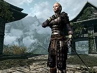
File:SR-npc-Delphine 03.jpg
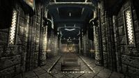
Delphine at Sky Haven Temple. The background looks amazing, and Delphine's posture seems perfectly symbolic to me of her character and dedication to her cause. Love the angle on it, too. I could be wrong, and maybe Psylocke can tell us, but it seems as if she is specially lit, like Magelight or Candlelight was cast off-camera to light up her face and armor. Regardless, it really complements the image.
- Support: As nominator. Minor EditsThreats•Evidence 03:30, 7 October 2012 (GMT)
- Support: Just like the Fire Spirit, I hesitate, though for admittedly nitpicky things. Two things bother me: low quality of the juniper bush and her eyes. Other than that, fantastic image, definitely FI. --HalfStache 22:07, 6 August 2012 (UTC) 04:52, 7 October 2012 (GMT)
- Comment: You're right ME, I used a Light spell to light up Delphine, as suggested by the tips on Help:Images to use a Light spell to brighten things. Before the lighting, her armour was dark and wasn't really detailed; the spell really helped. And I carefully chose that particular mountainous background and the low angle, coupled with Delphine's posture, to make the image more dramatic, and I think it turned out pretty awesome! ~ Psylocke 07:01, 7 October 2012 (GMT)
- Support:Delphine stands ever-vigilant. Everything is nice. The detail of her armor and blade, the mist in the background, her pose, the ruins around her. My only hesitation are her eyes, which look a little odd. But it's small enough for me to overlook.--Skyrimplayer (talk) 15:19, 7 October 2012 (GMT)
- Oppose: There is absolutely nothing special about this image. I don't think I can add anything to that. Nice just doesn't cut it, otherwise a lot of Skyrim can become featured because the game looks nice on its own ~ Dwarfmp (talk) 22:52, 7 October 2012 (GMT)
-
- Comment: To each his own, but you could apply the same argument against A Brush with Death, M'raaj-Dar, Paradise, and Lucien Lachance, all of which received support from you. In particular, a significant difference between this and the Lucien Lachance picture escapes me. Both are slightly off-center, upward-angled profile pictures of important NPCs with detailed, iconic backgrounds which, while "nice", bear "nothing special" about them. Minor EditsThreats•Evidence 23:22, 7 October 2012 (GMT)
-
- Both Paradise and A Brush with Death are images of unique places in the game. The other two require the right timing to take, especially Lucien, since he immediately appears and talks to you, granting you virtually no possibility to take a shot like that, and he disappears after the conversation. Besides, why are you questioning my opinion? I'm sure there are better things to do around here ~ Dwarfmp (talk) 01:30, 10 October 2012 (GMT)
- Because I respect your opinion, but it appears to me to be a hypocritical one in this instance. Everyone has their own tastes, but I assume we're all at least trying to apply consistent personal standards. Minor EditsThreats•Evidence 01:53, 10 October 2012 (GMT)
- Well in the end we are only saying "I like this one, and I don't like this one", it is influenced by our personal feelings. The examples you've given are all from Oblivion, and I think it's much more difficult to get a good shot like you would in Skyrim. Our Skyrim standards should be higher ~ Dwarfmp (talk) 03:06, 10 October 2012 (GMT)
- I have to disagree on that point. The ultimate question, as I see it, is essentially "Would this look good on the front page?" I don't see any reason to add what specific game an image comes from, or the lengths the photographer took to capture it, into that equation. Minor EditsThreats•Evidence 03:24, 10 October 2012 (GMT)
- We'd end up with tons of Skyrim images. There's already 2/3 of Skyrim images coming up. And I can't say that's just because it's popular right now ~ Dwarfmp (talk) 04:16, 10 October 2012 (GMT)
- So be it. Having a lot of great images is a fantastic problem to have. It's not like there's a limit to the number of images we can put on the FI queue, so I don't see why we should be altering our standards for FIs based on the game an image comes from. That seems arbitrary to me. With some limited caveats, we should be judging these images on their individual aesthetics. If that means we'll be adding an inordinate amount of Skyrim images, that's just Darwinian. Minor EditsThreats•Evidence 04:34, 10 October 2012 (GMT)
- We'd end up with tons of Skyrim images. There's already 2/3 of Skyrim images coming up. And I can't say that's just because it's popular right now ~ Dwarfmp (talk) 04:16, 10 October 2012 (GMT)
- I have to disagree on that point. The ultimate question, as I see it, is essentially "Would this look good on the front page?" I don't see any reason to add what specific game an image comes from, or the lengths the photographer took to capture it, into that equation. Minor EditsThreats•Evidence 03:24, 10 October 2012 (GMT)
- Well in the end we are only saying "I like this one, and I don't like this one", it is influenced by our personal feelings. The examples you've given are all from Oblivion, and I think it's much more difficult to get a good shot like you would in Skyrim. Our Skyrim standards should be higher ~ Dwarfmp (talk) 03:06, 10 October 2012 (GMT)
- Because I respect your opinion, but it appears to me to be a hypocritical one in this instance. Everyone has their own tastes, but I assume we're all at least trying to apply consistent personal standards. Minor EditsThreats•Evidence 01:53, 10 October 2012 (GMT)
- Both Paradise and A Brush with Death are images of unique places in the game. The other two require the right timing to take, especially Lucien, since he immediately appears and talks to you, granting you virtually no possibility to take a shot like that, and he disappears after the conversation. Besides, why are you questioning my opinion? I'm sure there are better things to do around here ~ Dwarfmp (talk) 01:30, 10 October 2012 (GMT)
- Oppose: I have to agree with Dwarfmp on this one. Just because it's a good-quality picture does not make it FI-worthy. Is the picture high-quality? Yep. Is it well-lit? Sure it is. But what makes it special? Delphine standing still, her hand held to her chest... Boring. No epic action shot, no beautiful landscape, nothing unusual, nothing that screams "Featured Image". This image doesn't even whisper it. I would much sooner nominate this image.
- Also, in Dwarfmp's defense, the examples that Minor Edits provide aren't the same. A Brush with Death is highlighting an out-of-this-world landscape that is intriguing to new users, but those who have played the quest will appreciate its beauty more greatly. Paradise also perfectly highlights an incredible world, although this one is more serene, whereas the other was more chaotic. I'm personally not a fan of the M'raaj-Dar photo, and I dislike the Lucien Lachance photo, so I have nothing to say to those. • JAT 01:05, 8 October 2012 (GMT)
- Support: I think this is a beautiful image that captures Delphine's dedication and nobility of purpose perfectly. The light spell washes out her face a little (although it is only really noticable on the full-size image), but not enough for me to vote no. --Xyzzy Talk 04:54, 10 October 2012 (GMT)
Oppose: Okay, I really like this shot, but I have to agree with some of the things said above (in particular, the juniper bush is unattractive, and while I don't mind the use of the light spell, the color looks unnatural on her face). If we could fix those things, I think this would be a really elegant image. ⇠eshetalk 16:54, 10 October 2012 (GMT)
Neutral:I agree that the img overall is wonderful - the backgrd, the armor detail, and the posture espcially. However, I also agree that her face is a lil too bright and the juniper blocks part of the magnificent view. If these 2 little issues are addressed, this img will hv my full support.--Honeystars (talk) 10:30, 15 October 2012 (GMT)
-
- Support:That did it. The 2 small issues have been fixed, and is definitely worthy of FI now. As promised, this img now has my full support.--Honeystars (talk) 10:22, 16 October 2012 (GMT)
- Comment: I uploaded a new image. As pointed out by some of you, I attempted to take a "cleaner" shot to fix certain issues. I still used the Light spell; it's far enough such that her face isn't "washed", but the detail of her Blades armour is still lighted. Also, I removed three trees on the background (including the juniper bush). I hope that by doing so, the image can gain a few more supports. ~ Psylocke 13:29, 15 October 2012 (GMT)
- Support: I've liked it from the beginning, but that's even better. To the rest of you, an image doesn't have to be flashy to have the same depth. I prefer how simple this one is compared to some of those flashy shots that are frequently put up. This image of Delphine, like Xyzzy said, really captured her dedication and her depth of faith to the cause of the Blades, and it makes this image perfect like it is. Colorful action scenes don't necessarily make for the only good feature images. Eric Snowmane(talk•email) 18:59, 15 October 2012 (GMT)
Oppose: I generally don't vote on these unless I support them, so I hate to do this, but I'm with Dwarfmp on this one. Psylocke has a lot of great images, but this one isn't FI-worthy in my opinion. — ABCface◥ 20:32, 15 October 2012 (GMT)- Oppose: Unremarkable. Weroj (talk) 03:25, 16 October 2012 (GMT)
- Comment: I feel forced to explain why this image should not be featured, the reasons of which I thought were obvious but I guess I was wrong about that. I'll just comment here instead of at my vote, because of the mass of comments there so, here. Since the mainly praised aspect is symbolism, let's start there. The supposed oozing dedication to her cause, is faint. As, I believe, she is inducting a member of the blades at that moment, this caption is ripped out of context. In light of the fact that, besides Delphine herself, I don't see anything else here that backs up this symbolism at all, I find it extremely hard to say: "Wow, what a brilliant shot that captures all of Delphine's dedication to her cause". That's partially because there's simply nothing else in this shot but emptiness, very evident on the left side of the image, now in fact empowered by taking away a tree or bush that was perfectly fine there (and not to mention supposed to be there in the first place). So I hear the background fills up the image, which is bland. There's not much to see, other than mist and mountains, things that don't make the slighest impression to me. Would the background have been clearer, it might have looked better. This could be because of the time of day mind you, which also affects the light on Delphine's face and armor. Using a light spell to brighten things up, instead of doing the least bit of effort to try another time of day, use a console command to clear the skies (or as Silencer pointed out to me, the clear skies shout), should disqualify the image instantly, because those are factors that are easily fixed in an image (the best images of the site should not be easily improvable). Though the update tones down the light spell, so it's this time not obviously a player-present image, Psylocke still admits to have used a light spell, which is something that should only be done in situations where there's simply no possible better light source. That said, the dark parts of the image are too dark as of now. All in all, I'm not saying this is a bad image, but there's just too much left to the imagination for this to be called the best. If you're looking for dedication, try the article itself ~ Dwarfmp (talk) 12:30, 16 October 2012 (GMT)
-
- The last update already has crushed the last version. Because of the light, not only does the background appeal much more, Delphine stands out a lot more. The tree is still absent sadly, it might have looked as it should (even though I didn't notice a problem with it) in the new light. At least now we're getting somewhere. However, I still can't say just yet if it's featured material, I'll have to think about it ~ Dwarfmp (talk) 14:10, 16 October 2012 (GMT)
- Comment: Uploaded yet another image. I couldn't get the sun to shine directly in front; that only happens around 7-8am I think, and is still a little dark for a shot. I used a 9am shot, so that the ruins behind are brighter. And just for the record, I still used the Light spell on this one, else her armor is half-dark on her left side. (I believe there are no rules that dictate the use of Light spells when taking pictures.) ~ Psylocke 14:39, 16 October 2012 (GMT)
- Vote: If the tree is restored then I support the image, I didn't have a problem with it in the first place. If it is left off, then I cannot in good conscience allow a false image to be a featured image. Moving people out of the way is fine, but altering the game for a good image is portraying a false image of the game. Silence is GoldenBreak the Silence 17:41, 22 October 2012 (GMT)
- Oppose: I'm all for making sneaky alterations to scenes to make them look better, but rather visibly removing details from the game just isn't right. As this nomination has been given about three weeks and all it's moved closer to is no consensus, I think it's fair to call it now. --AKB Talk Cont Mail 15:22, 29 October 2012 (GMT)
CONSENSUS: No clear consensus (four opposed to six support, with one conditional vote's oppose condition being met). --AKB Talk Cont Mail 15:29, 29 October 2012 (GMT)
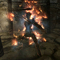
File:SR-npc-Fire Spirit.jpg
The Fire Spirit from the quest The Staff of Magnus. Just a collection of effects, really; oppose away if that bothers you, but I think it's an impressive image that would be eye-catching on the front page.
- Support: As nominator. Minor EditsThreats•Evidence 03:30, 7 October 2012 (GMT)
- Support: Looks excellent as a thumbnail, great at full size. My only issues with it are that it's a little dark (though this is a normal aspect of Skyrim gameplay, and thus its images) and I don't particularly like the way that random pillar (or wall support or whatever it is) is partially showing in the bottom left. But these are very minor issues, and I like the image enough to support it being featured regardless. — ABCface◥ 03:45, 7 October 2012 (GMT)
- Support: but with hesitation. Don't get me wrong, I love the image and would love to see it on the main page, but I feel that while it stands above 99% of the images on this site, it lacks something special to firmly entrench it as an FI. Support for now, but I may easily be swayed. --HalfStache 22:07, 6 August 2012 (UTC) 04:46, 7 October 2012 (GMT)
- Oppose: Like ABCface said, the image is too dark. The transparent NPC blends into the (incredibly dull) background too much. The effects also seem mismatched: the blue, ghost-like mist seems out-of-place beside the orange glow of the NPC and the (seemingly detached and rather strange looking) flames. To me, it just seems like a messy dungeon enemy, and I can't see any reason to feature it on the main page. It's a good image, but I don't think it should be a Featured Image. —Legoless (talk) 14:30, 7 October 2012 (GMT)
- Neutral:The fire surrounding the ghost makes it look pretty good, but the blue mist makes it look like it's been hit with a frost spell. It kind of ruins the whole flaming effect.--Skyrimplayer (talk) 15:19, 7 October 2012 (GMT)
- Neutral: Don't get me wrong, I love the idea of this picture. It's just that this picture isn't perfect in its execution. In particular, I think that a better backdrop could be chosen, to highlight its ethereal body and flames. • JAT 01:05, 8 October 2012 (GMT)
- Oppose: As stated above, the background is dark and uninteresting. If effects are the only reason to feature, it had better be spectacular, which it is very far from ~ Dwarfmp (talk) 01:42, 10 October 2012 (GMT)
- Oppose: Interesting composition, but the contrast is low enough that the image is hard to interpret as a thumbnail, and barely sufficient at full size. --Xyzzy Talk 04:49, 10 October 2012 (GMT)
- Oppose:As mentioned, img is too dark, and the blue and orange dont really mix. And also stated abv, the backgrd cld hav been better chosen (and brighter) in order to contrast with the npc itself and of course the flame effects. --Honeystars (talk) 06:58, 10 October 2012 (GMT)
- Oppose: It's not a bad shot, but I think we could get a better one. ⇠eshetalk 16:54, 10 October 2012 (GMT)
CONSENSUS: Opposed (3 support to 5 opposed). --AKB Talk Cont Mail 18:38, 15 October 2012 (GMT)
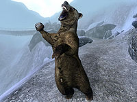
File:OB-creature-Brown Bear 02.jpg
This image is a great action shot of a Brown Bear getting ready to attack in Oblivion. Not only is it an exciting and perfect illustration of the bear, the surrounding landscape is very impressive and atmospheric. Players of Oblivion might also remember the location from its unusually high Brown Bear population at higher levels. It looks great as both a thumbnail and as a full-size image. With all the attention Skyrim has been getting lately, it might be nice to feature a Skyrim-themed Oblivion image. No flashy visuals or amazing graphics here, but an expertly taken shot which serves its function well.
- Support: As nominator. —Legoless (talk) 14:42, 29 September 2012 (GMT)
- Support: This is definitely a great shot for Oblivion. I support this for all the reasons given, and it makes me want to go bear hunting (though that will probably be done in Skyrim sooner than Oblivion...) :) — ABCface◥ 14:49, 29 September 2012 (GMT)
- Support: I always liked that shot. It will look excellent on the main page. --Krusty (talk) 15:03, 29 September 2012 (GMT)
- Support: What everyone else said. Eric Snowmane(talk•email) 16:26, 29 September 2012 (GMT)
- Neutral: I've become completely spoiled by Skyrim. It may have been worthy of FI status once, but in all honesty, all I can see now are the faults. The bear looks stilted, like it's about to fall over. It's bulging in the wrong places. The background is meh. Photoshop a microphone into that clunky paw and it's Amy Winehouse. Minor EditsThreats•Evidence 18:43, 29 September 2012 (GMT)
- Oppose: I may have also been spoiled by Skyrim, but even ignoring all the brilliant Skyrim FIs, this doesn't hold a candle to the Oblivion FIs. It gets blown away by the current FI and others like Paradise and Lucien Lachance. Now to get down to backing up my criticism. Point 1: it is an overall bland image, with only two basic colors in the whole thing. Point 2: the thumb makes it look like the bear is holding a coffee cup in it's right paw, while the left paw is limp like that of a t-rex. Point 3: same point ME made about the bulging on the bear. Point 4: look at the eyes. They are glazed over and it almost looks as though the bear could be blind. There are so many reasons that this image is unworthy of FI status, and the only thing going for it is a good angle and a good pose. Aside from those, I would label it as a bad image. With those, only "meh" --HalfStache 22:07, 6 August 2012 (UTC) 20:30, 29 September 2012 (GMT)
- Comment: Many of those complaints can be attributed to the outdated creature model, which can't be helped. The colours aren't vibrant, but I feel that the dark brown makes for a very nice contrast to the light grey. Lighting surprisingly isn't an issue, as you can see the bear's textures quite clearly. I also don't see how the "T. rex paw" can be criticized when the pose is later complimented. It might not have the cinematic effect that several other Oblivion FIs do, but I consider it to be one of the best of its class (for a comparison, see this miserable thing). —Legoless (talk) 20:54, 29 September 2012 (GMT)
- Comment: The outdated model argument doesn't really strike me as a very strong argument, as an FI should be able to transcend things like that. I guess I see what you mean by the nice contrast, but I still feel that the background is very bland. As for pose, I would say that the pose is good overall, and that the T. rex paw was only a minor complaint in the whole scheme. I will agree, however, that the lighting is good. --HalfStache 22:07, 6 August 2012 (UTC) 22:05, 29 September 2012 (GMT)
- Comment: Many of those complaints can be attributed to the outdated creature model, which can't be helped. The colours aren't vibrant, but I feel that the dark brown makes for a very nice contrast to the light grey. Lighting surprisingly isn't an issue, as you can see the bear's textures quite clearly. I also don't see how the "T. rex paw" can be criticized when the pose is later complimented. It might not have the cinematic effect that several other Oblivion FIs do, but I consider it to be one of the best of its class (for a comparison, see this miserable thing). —Legoless (talk) 20:54, 29 September 2012 (GMT)
- Oppose: I have nothing against the graphics in Oblivion, which I think are still pretty decent, but I just don't think this is good enough for a featured image. There is opportunity for a contrast between the background and the bear, but neither are particular interesting or good looking. The background is a bit dull and gray and the bear's claw is tilted at a weird, unflattering angle. That's just my opinion on the whole thing. --SlyKhajiit (talk) 01:24, 1 October 2012 (GMT)
- Oppose: The surrounding landscape is kind of dull with a monotonous bluish-grey; it isn't really outstanding or... atmospheric as claimed. And as pointed out above, the bear's right paw is umm... square-ish? When enlarged, I agree with HalfStache that the bear sort of looks weird. ~ Psylocke 07:01, 7 October 2012 (GMT)
- Neutral:Don't get me wrong, I love action shots, and this is a particulary good one. But just like others have said the paw looks like it's square when enlarged, and the tounge looks blue. Though the contrast is pretty nice, it's just not enough for me.--Skyrimplayer (talk) 15:19, 7 October 2012 (GMT)
- Support: I'll be honest, I love this picture. It just brings back a wave of nostalgia, from my Oblivion days. Its imperfections are what makes it perfect, from the glassy eyes to the awkwardly-shaped paw. Seeing this picture makes me reminisce of some of my greatest Oblivion adventures. In my mind, it's perfect. • JAT 01:05, 8 October 2012 (GMT)
- Support: An effeminate bear with a suspicious bulge in his trouser region about to clock you with a furry coffee mug. What else do we need to call this a featured image? --Xyzzy Talk 04:31, 10 October 2012 (GMT)
- Oppose:I may not be an editor at all here (only created acct few mths ago), but i hv used uesp for a long time and seen plenty of quality Oblv imgs on the frnt pg, and this img isnt even close. To me, this img is simply lacking color, and the backgrd isnt really that striking or impressive. Sure, it may hav gd contrast, but simply because it is perfect "because of its imperfections" (and yes, the bear does hv imperfectns) just isnt enough to put it on the frnt pg. --Honeystars (talk) 06:44, 10 October 2012 (GMT)
- Comment: I don't think that a lack of colour should mean an automatic disqualification. File:OB-place-Bruma.jpg has a very similar colour scheme to this, but achieved FI status regardless. While the image may look bland compared to File:OB-quest-A_Brush_with_Death_02.jpg, its subtle tones have their own merit. —Legoless (talk) 16:36, 10 October 2012 (GMT)
- Support: For Oblivion, this is a pretty cool picture, given that it's actually an action shot :). I actually like the colors, personally. A good feature for OB! ⇠eshetalk 16:54, 10 October 2012 (GMT)
CONSENSUS: Support (7 support to 4 oppose). --AKB Talk Cont Mail 18:38, 15 October 2012 (GMT)
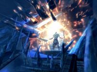
File:SR-quest-Touching the Sky.jpg
This image is of the scene where Vyrthur is collapsing the ceiling while raising frozen falmer and chaurus in an attempt to defeat you, during the quest Touching the Sky. Although he does this a few times, it is still an impressive feat, captured well in the image.
- Support: As nominator. Golden SilenceBreak the Silence 16:24, 10 September 2012 (EDT)
- Support: but only barely. This is a good image, a great shot, but I don't think it has something really special about it. Only the brilliant effects around Vyrthur swayed me to support. --HalfStache 22:07, 6 August 2012 (UTC) 21:36, 10 September 2012 (EDT)
- Neutral: It's kind of cool up close, but at as a thumb, it appears to be a ball of light with no real definition to it. And, as Halfstache said, it lacks that certain special something that makes it remarkable. This image only barely scores enough for me to call it "Neutral". Snowmane(talk•email) 22:03, 10 September 2012 (EDT)
- Oppose:I'm sorry, but it's just effects. It looks a lot like a cloak spell, it's to far off, and it doesn't have that extra push. I've noticed that a lot of our featured images are WOWZERS! Laughable I know, but the images that get the bronze star, have great angles, split second captures, unique poses, and the proper distance, this picture just doesn't have it, I'm afraid. Edit:I guess the thumbnail is cool. But once it get's larger it still looks like a cloak spell.--Br3admax (talk) 16:58, 11 September 2012 (EDT)
- Neutral: I like the angle and the timing, and it looks cool as a thumbnail, but everything looks very fuzzy if you try to view the full-size image. Granted, this is because the entire building was shaking in this picture, but I still believe that a better shot could be taken. • JAT 02:54, 12 September 2012 (GMT)
- Support: I really like the power that is expressed in this image. It looks really cool--Skyrimplayer (talk) 03:11, 12 September 2012 (GMT)
- It takes more than that to be featured statused, Skyrimplayer. Remember that this image, if voted in, will not only represent itself. It will represent all image quality, all article quality, and the quality of UESP and its community. Would you really stake all of that on this picture?--Br3admax (talk) 03:26, 12 September 2012 (GMT)
- Neutral: Despite the visual effects being completely outstanding, I don't want to risk the quality of future images to be based on just "special effects" alone. While it is a bonus for an image to have that, quality comes first. And I'm not overly impressed with the quality of the photo itself. Sorry - Helenaannevalentine (talk) 03:31, 12 September 2012 (GMT)
- Oppose: I find it exasperating when people dismiss a picture because it's nothing but "effects". The same can technically be said for any picture we've ever voted on; they're all just collections of effects one way or another. The other picture being voted on, Kindred Judgment, which currently has only support votes, is also "just" effects. It's a nonsensical argument. Anyways, I agree with Jak that this shot is pretty blurred up close. Too blurred. Minor Edits (talk) 23:09, 12 September 2012 (GMT)
- Oppose: It doesn't look very new or interesting, just the affects maybe. — Unsigned comment by Awsomedawg (talk • contribs) at 14:43 on 22 September 2012
- Support: Judgments about "effects" aside, I think this image is interesting and well composed. I assume that this is a cutscene, similar to File:SR-quest-Bloodline.jpg that was recently opposed. These screenshots of cutscenes tend to have the "blurry" effect that normal game screenshots do not. If people don't like the blurry quality, then so be it. However, this will tend to exclude any images of this sort. --Xyzzy Talk 14:51, 22 September 2012 (GMT)
- Oppose: Nothing about this image really speaks to me. It seems to be almost entirely comprised of two colors; the bright, fiery ball in the center is surrounded by a sea of dull blue. It makes most of the image feel a little monotonous, and though it does have the affect of drawing attention toward the center, the central figure is too small to be very interesting in my opinion. It's a nice image, but browsing through the other featured images on this site, I found that they were largely of a higher tier. --Kozol (talk) 15:48, 22 September 2012 (GMT)
- Oppose: When I first saw the image, I thought it was cool, and with all the nice fiery effects, it looks pretty—as a thumbnail. However, when enlarged, the image is blurred and there is too much blue. I pretty much agree with the reasons that ME and Kozol gave. ~ Psylocke 07:01, 7 October 2012 (GMT)
CONSENSUS: TIE (4x Support, 5x Oppose, 3x Neutral) --Krusty (talk) 14:59, 7 October 2012 (GMT)
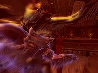
File:SR-quest-Kindred Judgment.jpg
This image is of the scene where you must confront and defeat Lord Harkon, you will arrive at this point no matter which side you choose in the war. In this image you can see Lord Harkon using Vampiric Drain with a unique animation. Additionally this scene takes place in front of the Shrine to Molag Bal, said to have given Harkon his abilities.
- Support: As nominator. Golden SilenceBreak the Silence 16:24, 10 September 2012 (EDT)
- Support: Simply mesmerizing. I love the clarity, the subtle particle effects, the lighting, the non-particle effects, and every single other thing about this image. Perfection. --HalfStache 22:07, 6 August 2012 (UTC) 21:36, 10 September 2012 (EDT)
- Support: Per Halfstache Snowmane(talk•email) 22:03, 10 September 2012 (EDT)
- Support:I'd like it a bit closer up, get to really see the Vampire Lord in all of it's glory and raw power, but it is still a great image.--Br3admax (talk) 16:59, 11 September 2012 (EDT)
- Support: I love the detail of this image. • JAT 02:54, 12 September 2012 (GMT)
⇠eshetalk 14:49, 19 September 2012 (GMT)
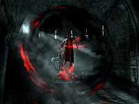
File:SR-quest-Bloodline.jpg
This image is of the scene where Lord Harkon bestows his "gift" upon you during the Dawnguard DLC quest, Bloodline. The image captures the point where your soul is being altered to allow the Vampire Lord transformation to take place. Though rather graphic, it is still a striking image, the point at which you have wagered your soul in order to gain God-like powers.
- Support: As nominator. Golden SilenceBreak the Silence 16:24, 10 September 2012 (EDT)
- Oppose: While it makes a great thumb, up close it is not as good. First off, it is not as smooth as I would like, though that is not as major. What I greatly dislike about this image is the the sword, which obscures Harkon, the main character's head, which just looks odd in this pic, and something about the angle that I just can't put my finger on. --HalfStache 22:07, 6 August 2012 (UTC) 21:36, 10 September 2012 (EDT)
- Oppose: It's not very clear, at least to me, what the image is supposed to be. I like images that are clear. It's colorful though :) Snowmane(talk•email) 22:03, 10 September 2012 (EDT)
- Oppose:All of the above comments, plus it's just feeding. It doesn't seem amazing enough for me.--Br3admax (talk) 17:01, 11 September 2012 (EDT)
- Oppose: (edit conflict) The image has a player character in it, with some odd items and spell effect shaders. A better action shot could be gotten by the player as a Vampire Lord. The meaning behind the image (i.e. "wagering your soul") doesn't outweigh the image's quality. —Legoless (talk) 17:06, 11 September 2012 (EDT)
- Comment:Yeah no PC(Player Character) shots, and "wagering your soul", "God-like powers"?" A bit of an over statement, don't you think? This image just doesn't scream, "Make me a featured image, now! It's akin to the player feeding, same red screen and everything.--Br3admax (talk) 17:23, 11 September 2012 (EDT)
- Oppose: Time to join the group of people opposing this picture! I agree with most of what's been already said. The significance of the situation isn't enough to make me overlook the image quality. • JAT 02:54, 12 September 2012 (GMT)
- Oppose As image taker. I wasn't particularily pleased with the composition of the image. It just seemed like a "better for now" image. --Xyzzy Talk 03:17, 12 September 2012 (GMT)
CONSENSUS: OPPOSE 1 for, 6 against
SR-quest-Pieces of the Past 08.jpg
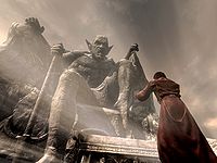
The picture shows Silus Vesuius, trying to invoke the power of Mehrunes Dagon during the quest Pieces of the Past. The oppressive nature of Mehrunes Dagon is captured well by the statue, with a natural snowdrift providing atmosphere.
- Support: As nominator. The Silencer speaksTalk 20:49, 6 August 2012 (UTC)
- Neutral: I find myself at the middle of the road here. It is a good image, and I would not dislike it on the front page. The angle is great, the snow-piling on the statue looks better than it often does elsewhere, and I like how you can actually make out the daedric writings on the altar. On the other hand, there are a couple things which bother me. The first of which is Silus' left hand/arm, which has a bit of a blur surrounding it. The second, and more major bit was the snowdrift. I feel that it just doesn't look quite right, and is awkwardly placed, obscuring (almost bleaching) part of the altar and part of Mehrunes Dagon's leg. --HalfStache 22:07, 6 August 2012 (UTC)
- Oppose: I think a better shot of this is possible ~ Dwarfmp 22:55, 6 August 2012 (UTC)
- Support: I think this is an absolutely brilliant image – and it looks just as good (even better?) as a thumb, which is extremely rare for a Skyrim snapshot. What attracted my attention only minutes after it was uploaded was the snowdrift – it is absolutely stunning and is what makes this image unique. It almost resembles a spotlight from somewhere, making this image quite surreal. The hazy statue in the back is another plus – as it makes the colorful NPC the eye-catcher, and his angle leads the eye to the threatening statue above. I can’t find anything wrong here; in my book, it’s flawless and - dare I say it - absolutely brilliant. --Krusty 23:14, 6 August 2012 (UTC)
- Support: As a full-size image, the snow drift makes it a bit too hazy. As a thumb, I think it makes the image look much more dramatic. The angle, I think, is wonderful--Dagon's glaring down at the petty mortal Silus, looking as if he's about to rise, which I think the drift also helps to emphasize. Vely►t►e 23:21, 6 August 2012 (UTC)
- Support: An excellent shot. It took me a minute to realize that the drift was actually snow and not light beaming down. The angle, colors, background, focus, everything is perfectly captured in this image. Even the sky complements the image. I love it. • JAT 00:01, 7 August 2012 (UTC)
- Support: Per Jak Snowmane(talk•email) 17:14, 7 August 2012 (UTC)
- Support: This is a beautiful screenshot,in all my time playing Skyrim I have never seen anything like this.--Skyrimplayer 17:34, 7 August 2012 (UTC)
- Oppose: The angle is excellent, but I didn't like it at first glance, and I still don't like it! It's probably the haziness and the somewhat muted colours, making the picture lackluster. WerojTalk Contribs 01:04, 23 August 2012 (UTC)
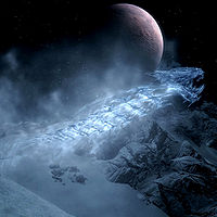
File:SR-creature-Ice Wraith.jpg
An amazing shot of an Ice Wraith.
- Support: As nominator. Coronus 05:27, 27 June 2012 (UTC)
- Support: Wow. Just ... Wow. Minor EditsThreats•Evidence 05:32, 27 June 2012 (UTC)
- Support: I've seen this before on the Wiki glad someone finally nominated it. Stellar image. --Lore Master 05:48, 27 June 2012 (UTC)
- Support: When I first looked I thought that surely this is a pre-release image, which shows just how good this image is. The moon dominates the full image, but doesn't impact on the thumbnail. Either way it is a very good image. The Silencer speaksTalk 18:03, 27 June 2012 (UTC)
- Support: Awesome image. Definitely worth FI status. ABCface◥ 20:23, 27 June 2012 (UTC)
- Support:That looks awesome! Not much to say, really. ES(talk•email) 20:29, 27 June 2012 (UTC)
- Support: Yes. This is what a featured image is supposed to be. --SlyKhajiit 23:19, 27 June 2012 (UTC)
- Support: Really, the image speaks for itself. • JATalk 01:11, 28 June 2012 (UTC)
- Oppose: A very detailed shot of an ice wraith, but not really remarkable IMO. WerojTalk Contribs 15:30, 30 June 2012 (UTC)
- Support: Every time I look at this picture I have to study it, because the positioning of the Ice Wraith in the foreground makes it look bigger and more dragonesque than it really is. Also, the ruddy moon in the background adds an element of spirituality to it. MethodicMockingbird 17:05, 14 July 2012 (UTC)
- Support: An excellent picture, especially considering it is almost impossible to get a good close-up look at an ice wraith- I never knew they were so detailed. The moon behind it makes it look cool too. RIM 19:34, 14 July 2012 (UTC)
- Support: O.O! The view is simply breathtaking. The angle which the picture is taken from to include the moon and mountaintops in the background — genius! Epic would be an understatement. This picture definitely deserves 'Featured' status. ~ Psylocke 14:12, 15 July 2012 (UTC)
- Support: I have been gone for awhile, and this was one of the first things I saw upon my return, and I was certainly glad to be back! This is one of the best pictures I've seen on the site. 'Nuff said. --HalfStache 20:37, 16 July 2012 (UTC)
- CONSENSUS: SUPPORT --Krusty 06:43, 5 August 2012 (UTC)
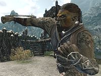
File:SR-quest-Fight!_Fight!.jpg
A great shot of Chief Burguk in a brawl.
- Support: As nominator. I've never been a huge Orc enthusiast, but this picture is BA. I think it highlights how much better some of the races look in Skyrim than in previous games, and I feel sorry for Kimi's poor mage who had to die for the sake of the image. ABCface◥ 20:31, 27 June 2012 (UTC)
- Oppose: Weakly. It has the potential to be cool, but the angle... I am not a fan of the angle. ES(talk•email) 23:22, 27 June 2012 (UTC)
- Oppose: This is barely an opposition, I would have gone with neutral, but then my vote wouldn't matter. While this image looks great, and the details are super sharp, I just don't think it's anything so spectacular that it becomes worthy of being featured. Kimi does have my sympathy though. --SlyKhajiit 23:24, 27 June 2012 (UTC)
- Support: Love the angle. I think it would be eye-catching on the home page. It'd kind of look like the Orc really hates the latest news and is punching it. It's better than J'Ghasta, and that was an FI. Kimi has my applause. Minor EditsThreats•Evidence 23:40, 27 June 2012 (UTC)
- Support: For the same reasons as Minor Edits. • JATalk 01:11, 28 June 2012 (UTC)
- Support: Cool action shot! WerojTalk Contribs 15:30, 30 June 2012 (UTC)
- Support: I nominated J'Ghasta, so I have to support this image. It has an interesting angle, and shows off Skyrim's detailed animations well. —Legoless 12:50, 12 July 2012 (UTC)
- Support: For all the previously mentioned reasons. --HalfStache 20:34, 16 July 2012 (UTC)
- CONSENSUS: SUPPORT --Krusty 06:43, 5 August 2012 (UTC)
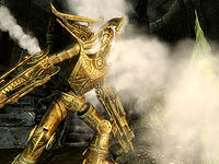
File:SR-quest-The Only Cure 07.jpg
A high quality image that shows a Dwarven Centurion using it's Steam Breath attack.
- Support: As nominator. The Silencer speaksTalk 22:45, 25 June 2012 (UTC)
- Oppose: It is a cool picture but half of it is obscured by steam. I know that is the point but a clearer view of the centurion's head would be better imo.--Grim765 22:50, 25 June 2012 (UTC)
- Support: An excellent action shot, though the steam does seem a bit odd as it isn't obvious that the Centurion is producing it. Besides that, I like it. --AKB Talk Cont Mail 23:00, 25 June 2012 (UTC)
- Support: Really powerful image, and I actually like the steam – not only does it make the thumb look great, it also reminds me of the attack that has killed me the most. --Krusty 23:17, 25 June 2012 (UTC)
- Oppose: Ehhh... It looks cool, but it just doesn't click as something noteworthy. Note that this is only a weak oppose though. ES(talk•email) 23:20, 25 June 2012 (UTC)
- Oppose: I very much agree with Snowmane's reasoning. When I saw this, it didn't necessarily click to me that it was something so notable that it deserved to be feature. Plus, I think the fact that I pretty much despise nearly all things Dwarven probably turns me off from it too. --SlyKhajiit 23:29, 25 June 2012 (UTC)
- Support: Very cool. It's dramatic and the Steam with the Centurion's "Gold" creates a unique scene with an otherwise dark background. As for the above poster just cause you don't like the Dwemer doesn't merit in my eyes a "thumbs down". --Lore Master
- Support: Good composition and dramatic pose. Also a testament to the poster's perseverance since setting up that shot probably took a lot of work. Coronus 00:07, 26 June 2012 (UTC)
- Support: I agree with everything that the people who support this image have said. A nice action shot, excellent steam effect, looks great as a thumb, great contrast between the gold Centurion and the dark background, looks like it took a lot of work, and was nominated! • JATalk 05:02, 26 June 2012 (UTC)
- Oppose: I agree with Snowmane. As much as I enjoy humidifiers, they lack a certain grandeur I look for in FIs, even when they're in the form of a gold-plated robot. Also, although I'm always fascinated by a good cloud of steam, I feel like the image should be more centered on the automaton. Minor EditsThreats•Evidence 07:42, 26 June 2012 (UTC)
- Support: Some of you may know that I'm considered one of the best photographers here, and some of you may know that for some reason I find it hard to accept other people's images as the best they can get. However, I'll gladly admit that this one is very impressive. While I'm a sucker for gold, I'm most impressed by the quality of the graphics, and the way the contents are set up here. The steam even looks good to me (which could be considered strange because it's just a bunch of white gas). It is prevalent, though it is not prevalent enough to obscure the image. Minor Edits states the centering is off, but I would have to disagree, as the Centurion is in fact taking focus equally as the steam. As such, it depicts the concept of the Centurion blasting steam perfectly. As a bonus, the steam also doesn't obscure anything too much of the Centurion. All in all, I can say that this picture seems just right on all aspects ~ Dwarfmp 08:34, 26 June 2012 (UTC)
-
- Comment:Also of note is the background and lighting. The shot was set up with excellent lighting on the centurion but without sacrificing the dramatic dark background and the vertical vectors created by the pillars in the background add a tense atmosphere to the scene while also providing a framing effect. Coronus 05:16, 27 June 2012 (UTC)
- Oppose: Too much steam. WerojTalk Contribs 15:30, 30 June 2012 (UTC)
- Oppose: ^. And, there's nothing else. It's not a bad picture, but it's just a Dwarven Centurion and that's it. I think any other picture of one could look like this. MethodicMockingbird 17:05, 14 July 2012 (UTC)
- Support:I don't like this image as a thumbnail, which is how it will be seen most of the time, and that's why I was withholding a vote before now. But, with as many 'oppose' votes as it's getting (seriously?!), I have to throw my support in, because I love it at full size, and I do think it deserves FI status... even though I still don't like it as a thumbnail. ABCface◥ 19:30, 14 July 2012 (UTC)
CONSENSUS: SUPPORT (8 Support vs 6 Oppose) --Krusty 20:57, 16 July 2012 (UTC)
File:SR-place-Lake Ilinalta.jpg
An excellent image, that really shows what Skyrim has to offer in the way of graphics.
- Support: As nominator. • JATalk 16:44, 24 May 2012 (UTC)
- Neutral: It looks cool, but the tree in the front center, almost seems like the subject of the picture at first glance. Well, to me at least. Snowmane(talk•email) 17:50, 24 May 2012 (UTC)
- Oppose: It truly pains me to do this, but Snowmane has pointed out something which I now cannot ignore. Don't get me wrong, I love 95% of the image, but the 5% (the tree) seems to be the main feature. I also polled a couple people, and the more observant one said that the tree was the first thing he noticed. It just seems to me to be a bit awkwardly placed, and is in much better focus than what should be the main feature, the lake and the banks, which provides a bit of an odd look. Before I end this comment though, I do want to point out that this is just barely an oppose, and that this is otherwise a brilliant image. --HalfStache 01:03, 25 May 2012 (UTC)
- Oppose: The only thing going for it is the graphics, and I think we should move on from that being the only reason. It is a nice nature scene but I think a better picture of the lake can be taken from a short distance to the left, beyond the trees there. The Silencer has spokenTalk 01:45, 27 May 2012 (UTC)
- Support: After viewing this pic many, many times, it stands out as probably the best TES "nature scene" I've seen. It does a brilliant job of showing off the region around Lake Ilinalta, which is possibly the most beautiful in Skyrim. To address the opposition, the only thing all these pics have going for them is their graphics, technically; it's a digital world where everything has to be sculpted. The only thing going for all these former FIs were their graphics: the Eldergleam (now that's a photo where the front center tree is the subject!), Mount Sheogorath, Lake Masobi Bruma, the Imperial City, Frostcrag, and the list goes on. Also, the Bleak Falls Barrows nomination above only has graphics going for it, and I could just as easily claim that the coffin in the front center seems like the subject of the picture at first glance. Sorry if I'm laying it on a little thick, but I like this photo, and after mulling it over for quite a while, I think the criticisms here lack merit. Minor EditsThreats•Evidence 20:40, 15 June 2012 (UTC)
- Oppose: While the image is rather pretty, I just can't stand that tree that is front and center. --AKB Talk Cont Mail 23:00, 25 June 2012 (UTC)
- Oppose: I like the picture but that tree ruins the composition of what would be an otherwise excellent shot. Coronus 00:15, 26 June 2012 (UTC)
- CONSENSUS: Oppose (two support, four oppose, and one neutral). --AKB Talk Cont Mail 00:21, 26 June 2012 (UTC)
File:SR-quest-Bleak Falls Barrow.jpg
While patrolling, I came across this image. I like it, because it captures the atmosphere of the cavern very well. Whether or not it's FI worthy, I'll let the community decide.
- Support: As nominator. • JATalk 01:13, 16 May 2012 (UTC)
- Support: Great image. Very crisp visuals and great lighting (as most FIs). There's a couple little things that annoy me, like the shadowing on the plants, but they don't detract much from an image which is brilliant all together. --HalfStache 03:53, 17 May 2012 (UTC)
- Support: Great image, worth FI status for sure. ABCface◥ 01:20, 27 May 2012 (UTC)
- Neutral: Something just seems, off, to me, I think it may be the light from the top. I can live with a support as there isn't really anything wrong with it, but would prefer it not to be. The Silencer has spokenTalk 01:49, 27 May 2012 (UTC)
- Support: A yay from me. Reminds me of 11.11.11 - great and moody too! --Krusty 22:51, 20 June 2012 (UTC)
SR-quest-Dragon Rising 05.jpg
This is another great image. It appears cinematic, which is rare for the TES series.
- Support as nominator. elliot (talk) 19:13, 5 May 2012 (UTC)
- Support: An excellent image. Need I say more? Really, the image speaks for itself. • JATalk 19:29, 5 May 2012 (UTC)
- Support: I was really waiting for this one to get nominated! Thanks. Well, I've opposed one of my images before, so I'm sure I can support them as well! I've managed to make a weird looking horn-blower guy into a brilliant shot, considering you have a good shot of the guard and can see why he's blowing the horn in the first place. That dragon happened to pop in at just the right time, and seeing as I have taken a lot of shots of this guy I wasn't happy with, I can tell you that it was a rare occurence. To me, it looks like an awesome portrait, and I'm very happy to have accomplished that ~ Dwarfmp 19:46, 5 May 2012 (UTC)
- Support: I always like to point out specific examples in an image of why I support or oppose, but for this one I cannot. There's so many things which aren't spectacular alone, but the combination of all of them works great. This image proves that a whole can be better than the sum of its parts. --HalfStache 01:55, 6 May 2012 (UTC)
- Support: Love the 'cinematic' look, just as Elliot said. Loved it the first time I saw it, and definitely think it's worth being featured. ABCface◥ 04:06, 6 May 2012 (UTC)
- Support: An awesome shot. Well done! eshetalk 16:33, 12 May 2012 (UTC)
- Support: A masterful shot, no less. With eye-catching flames, an NPC in perfect pose, and the added bonus of a dragon lurking around in the skies, this is a no-brainer. Before Dwarfmp pointed me to this image, I’d never even noticed the hornblower guy – and that is also what images can do; show people what they may have missed. Great job! --Krusty 23:44, 13 May 2012 (UTC)
- Support: Iconic. This picture IS Skyrim. MethodicMockingbird 02:29, 27 May 2012 (UTC)
- CONSENSUS: SUPPORT --Krusty 06:02, 10 June 2012 (UTC)
File:SR-creature-Odahviing Battles Elder Dragon.jpg
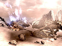
I think this is a better picture than Alduin's Bane 02. It has two dragons fighting each other, and doesn't have the same issues. It looks fantastic with the fire contrasting the night sky and lighting up both dragons, with some fire being deflected by the drgon. The only thing is that the fire seems to come from slightly behind the dragon's mouth.
- Support: As nominator. The Silencer has spokenTalk 15:08, 12 May 2012 (UTC)
- Support: An excellent image, and just the kind of thing everyone loves: a midair battle between dragons. The stormy/dark background really emphasizes the fire, too. Vely►Talk►Email 15:14, 12 May 2012 (UTC)
- Support: A great image, and much better than the other dragon fight being nominated. I agree with all of the praise, and would also like to compliment the camera angle. --HalfStache 16:13, 12 May 2012 (UTC)
- Support: This is a wicked cool shot, and it should definitely be featured. Nice job, Xyzzy! And on a side note, it's Skyrim for goodness' sake—there's no reason we couldn't have more than one featured image that has two dragons in it ;). eshetalk 16:33, 12 May 2012 (UTC)
- Support: Excellent shot, definitely worth FI status. ABCface◥ 19:24, 12 May 2012 (UTC)
- Support: The picture really speaks for itself. Epic. I've seen my fair share of dragon battles (even a three-way battle, that was pretty intense with two Ancient dragons and only fur armor) but this picture really captures the incredible awe one feels when witnessing these moments very well. • JATalk 05:07, 13 May 2012 (UTC)
- Oppose: Have to side with minor discrepancies disfiguring the shot (though it is still a very good photo). The upward stream of fire seems like a flow of lava upon the mountain in the background, and the trees look to be clipping into the left-most dragon. MethodicMockingbird 02:29, 27 May 2012 (UTC)
- CONSENSUS: SUPPORT --Krusty 06:02, 10 June 2012 (UTC)
File:SR-interior-Temple of Talos (Windhelm).jpg
I love this image. The lighting within the temple, on the statue, and on the architecture is pretty cool looking. It caught my eye as soon as I saw it. Plus, it has great meaning for the story as a whole.
- Support as nominator. elliot (talk) 03:31, 14 May 2012 (UTC)
- Support: Great quality, good shot, awesome lighting. How can anyone oppose? --HalfStache 03:47, 14 May 2012 (UTC)
- Support: Great image, definitely worth featuring. ABCface◥ 03:50, 14 May 2012 (UTC)
- Support: The light in the window shining on the altar is what got me. Snowmanetalk•email•my edits 03:52, 14 May 2012 (UTC)
- Support: I'm running out of unique things to say about these images, so all I'm going to say is Yes. Also, I now have a new background picture :D • JATalk 04:33, 14 May 2012 (UTC)
- Support: I think the word is atmosphere. The Silencer has spokenTalk 07:59, 14 May 2012 (UTC)
- Support: Not much else to say, really, other than that this makes me sad my version of Skryim doesn't let me take pictures.--Ghurhak gro-Demril or TAOYes? 08:54, 14 May 2012 (UTC)
- Neutral: A very good image, the subject is cool, and the lighting is nice as well. But, I think this image would be even better if it was taken during the night time. The color contrast inside of the temple is so striking and beautiful. --SlyKhajiit 22:57, 17 May 2012 (UTC)
- CONSENSUS: SUPPORT --Krusty 06:02, 10 June 2012 (UTC)
File:SR-quest-Alduin's Bane 02.jpg
This image is pretty fantastic. It's one of the great battles of the game; plus, it's two dragons. You can't go wrong there.
- Support as nominator. elliot (talk) 17:44, 5 May 2012 (UTC)
- Oppose: Hate to get nitpicky, but some of the rocks at the bottom, as well as the bottom part of one of the right dragon, have odd white-ish margins on them. Also, the weird shadowing on the largest of the boulders approaching the character bugs me. --HalfStache 18:20, 5 May 2012 (UTC)
-
- Considering that is what the game looks like, I don't see how you can hold it against the image. elliot (talk) 19:13, 5 May 2012 (UTC)
- Now there's nothing wrong with describing features of a game as bad things, everyone is entitled to have an opinion. And I'm rather nitpicky myself, so I see where he's coming from ~ Dwarfmp 19:46, 5 May 2012 (UTC)
- Considering that is what the game looks like, I don't see how you can hold it against the image. elliot (talk) 19:13, 5 May 2012 (UTC)
- Suport I'd have to agree with Elliot; what small graphical oddities there are don't really detract from what is a truly impressive image. Dlarsh(T,C) 19:26, 5 May 2012 (UTC)
- Support: After some consideration, I've come to the conclusion that this is a great image. The shot itself isn't all that great, but considering there are two dragons in it (and I know how hard it is to get a decent shot of one dragon on it's own), it is most likely the best shot you can get. Another problem would be the general white tone to it, which pops up most as negative when you see the thumb. However, the previously mentioned white lines are part of the image, and may only be considered somewhat strange if you look at it in full zoom (and look like a cool effect in the large thumb). All in all, it's a cool image, one of those shots you very rarely get to see, so it would be deserving of getting featured ~ Dwarfmp 19:46, 5 May 2012 (UTC)
- Oppose: The dragon on the right (Paarthurnax) has some white dust covering the front half of his body in the image. It looks like a smudged photo. It looks great otherwise though. Vely►Talk►Email 20:36, 5 May 2012 (UTC)
- Support: Now, I think this image is really awesome and definitely worthy of a featuring. It has great visual appearance and a cool subject matter. BUT this is a picture of the same quest that is already in the queue for a featured images in a few weeks. And like the image I featured above, it's a similar image, just with Paarthurnax in it. So, I nominate this picture, and move forward the motion to remove the other Alduin's Bane picture from the featured list. --SlyKhajiit 16:25, 6 May 2012 (UTC)
- Support: I really like this shot – an entirely different color scheme than what we’ve come to expect from Skyrim and an incredible amount of detail. Brilliant. --Krusty 09:14, 8 May 2012 (UTC)
- Oppose: Seems really dull and yes it may be a great image, but the tiny errors and mistakes with it add up to make it not so great --Honda1996 10:45, May 8th 2012
- Support: Great colours indeed, and the pose/camera angle is nice too. WerojTalk Contribs 10:51, 8 May 2012 (UTC)
-- CONSENSUS: SUPPORT --Krusty 11:34, 30 May 2012 (UTC)
SR-place-Hall of Valor.jpg
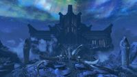
The Hall of Valor: A place a eternal glory, honor, feasting, and most importantly, beauty. I can't find a reason why this wouldn't be a lovely feature image. It's striking, full of content, and relevant.
- Support: As nominator. • SlyKhajiit 23:12, 23 April 2012 (UTC)
- Neutral:
Support: A fantastic image.• JATalk 04:14, 23 April 2012 (UTC) - Neutral: I'm beginning to think that getting featured Skyrim images will be easy, since the game's graphics look nice on their own, regardless of angle etc. But perhaps that shouldn't be a reason to disqualify, at least not yet... And it is a picture of a unique location in Skyrim after all. However, its colors seem rather monotone, now that I've taken a good look (at least it obviously looks that way from the thumb). I'm going to keep my vote neutral, but perhaps my comments will influence other people's votes either way.
In any case, I do think the image should be renamed~ Dwarfmp 04:35, 23 April 2012 (UTC) - Support: The picture does a good job a capturing the place, and I'm also a sucker for any type of aurora, such as the subtle ones in the sky. The mists at that chasm also provide a cool effect. As for the possibility that it may seem monotone, that's because its nighttime, which makes everything a little bit darker. Halfstache 00:05, 24 April 2012 (UTC)
- Support: I like it...it's kind of cool and ethereal. Works for me! eshetalk 16:33, 12 May 2012 (UTC)
- Oppose: I think we are beginning to nominate some images purely for their subject matter, and not the actual shot. I really don't find anything special with this version. The NPC is in the shot; while not normally bad, it doesn't really help this image. This can be better, so we shouldn't feature this version. elliot (talk) 05:06, 14 May 2012 (UTC)
- Oppose: The image is nice and everything, yet it feels somewhat ‘flat’ and a bit dull. The presence of a very small Tsun doesn’t really help either, as he almost melts in with the surroundings and becomes that thing you have to look at twice before you get it. --Krusty 05:22, 14 May 2012 (UTC)
- CONSENSUS: TIE (3 SUPPORT, 2 OPPOSE, 2 NEUTRAL) --Krusty 07:56, 27 May 2012 (UTC)
OB-quest-A Brush with Death.jpg
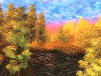
I really love the colors in this picture, and I find it quite striking-even if it is not an image from the visually amplified world of Skyrim.
- Support: As nominator. • SlyKhajiit 18:24, 28 April 2012 (UTC)
- Support: Overly saturated, just like the world it's picturing. I like it. • JATalk 22:41, 28 April 2012 (UTC)
Support: I think this is a great image because of how "different" it is. I especially like how perfectly all of the unusual and smeared textures blend with the unusual (for an ES game) colors. In addition, it will certainly stand out on the main page. Halfstache 02:22, 29 April 2012 (UTC)- Oppose: Per Krusty. I stand by my previous statements, but I agree that we shouldn't have two extremely similar images featured. --HalfStache 18:05, 5 May 2012 (UTC)
- Support: Perhaps a little bit on the small side. Perhaps a shot of a plain in the painting world would be better, though I do think the way it is now is well-centered, shows almost all of the cool features of the world. All in all, it looks special, I can see this appearing on the main page ~ Dwarfmp 17:53, 29 April 2012 (UTC)
- Neutral: I think this image has great potential, but I have some concerns. First off, the biggest item in the image is a big rock. It's also in the front of the image. It would better if there was a good chunk of space between the viewer and the "large item" (look at the MW image above). I also think should be careful not to support this just because it looks different. In order to be featured, it really has to be one of the best shots we can get, and I don't see that in this one. elliot (talk) 18:07, 29 April 2012 (UTC)
- Oppose: We featured this image a year ago, and while the nominated image is great, I'd much rather see something 'new' on the main page. --Krusty 17:52, 5 May 2012 (UTC)
- Comment: I think this picture is a lot better than the troll image to be honest. For me, it would be stupid to oppose it, but I just want to point out the fact that if an image shouldn't get featured because of another similar one is a stupid reason, also, featured images are ultimately there to spice up the main page, so featuring similar images is not going to be problematic, since the feature is rather short-lived anyway ~ Dwarfmp 19:46, 5 May 2012 (UTC)
- Oppose: As per Krusty. It's the painted troll image again, just without the troll. --Legoless 18:02, 5 May 2012 (UTC)
- Oppose: Looks very vivid and striking, but I think it's good just because the painted world in general looks great; It should be easy to get a much better screenshot than this, IE. one that doesn't feature a giant rock. =) WerojTalk Contribs 10:51, 8 May 2012 (UTC)
- Comment: I think this offers a different view then the troll image. It shows more of the enviroment, which is why I would like to see it on the front page. --71.178.236.115 16:11, 21 May 2012 (UTC)
- CONSENSUS: TIE (4 OPPOSE, 3 SUPPORT, 1 NEUTRAL) --Krusty 07:56, 27 May 2012 (UTC)
SR-quest-Alduin's Bane.jpg
Came across this image while patrolling. It looks cool. Need I say more?
A major concern with this one is that it is a spoiler, but to be honest it's only a spoiler in hindsight - you have to have done the quest first to know what this image means. Anyone who hasn't progressed that far into the main quest won't know what this picture means.
- Support: As nominator. • JATalk 07:20, 1 April 2012 (UTC)
- Support: Nice image. Enough Said. --Manic 18:12, 7 April 2012 (UTC)
- Support: No individual thing in this picture is as breathtaking as some of our best, but every bit of it is better than average, which makes this a brilliant image as a whole. As for the spoiler bit: "This site's purpose is to provide information; therefore, most of the content contains spoilers," according to the main page. Halfstache 03:47, 9 April 2012 (UTC)
- Oppose: I don't mind the spoiler aspect of this image, I just don't really like it. The elder scroll effect looks cool, but Alduin & friends in the middle are just a kind of ugly lump. Weroj 11:58, 9 April 2012 (UTC)
- Support: Is this the best possible capture of the event? I don't know. What I do know is that I do like it. Of course, we are to thank the game for that, but it's a good capture of the event. And it's something to honor all the work of the fallen contributor ~ Dwarfmp 04:35, 23 April 2012 (UTC)
- Support: Agreed with Dwarfmp -Nobody knows if this is the ultimate documentation, but it is awfully dam good and belongs on the main page. --Krusty 02:28, 29 April 2012 (UTC)
- Oppose: I'm not trying to hurt the feelings of the photographer or the nominator-but I just don't like this picture. It's a really cool and critical moment in the main quest, but I don't believe this particular picture really captures the moment in the best way possible. The cluster of Alduin and the ancient Nords is a turn off as well as the contrasting colors in the image. Perhaps the moment where Felldir the Old has the scroll above his head while Alduin is casting fire at him would make a much better featured image. SlyKhajiit 14:46, 29 April 2012 (UTC)
MW-place-Tel Naga.jpg
I know we already have a similar image on the queue, but this one looks good. I especially like the sky in this picture - a rare image of one of the hidden gems of the series.
- Support: As nominator. • JATalk 22:11, 13 April 2012 (UTC)
- Support: As a big MW fan, I am a sucker for these kinds of images... Maybe I am just a nuthead, but I like that the angle makes it look like it could be a plant based creature... or I am crazy lol. Anyways, it rocks! ESQuestion?•Email•Contribs 22:14, 13 April 2012 (UTC)
- Support: We need more featured MW images, and this definitely fits the bill. The draw distance also forces more focus onto the main feature, which is great. Halfstache 23:59, 13 April 2012 (UTC)
- Support: Great image. It's almost interchangeable with the previous nomination, but hey, I guess there's nothing wrong with a double dose of Morrowind love. Weroj 00:48, 14 April 2012 (UTC)
- Support: Again, I ask a similar question as the nomination above: does this image provide us with a complete view of this building? Are there any parts not viewable? I can't tell since Morrowind's building are rather... unique. Of course this is only of concern for the intro image to the article about the tower. The image itself looks good, what can not be said for other parts of the game. It also looks great as a thumb ~ Dwarfmp 04:35, 23 April 2012 (UTC)
File:SR-creature-Blood_Dragon_Attack.jpg
So, I pulled up my watchlist, and was reading through my links when I found Minor Edit's nomination on the FA page. I clicked on the link and was skimming through the page when I saw this image. It is a truly fantastic image. Just look at it!
- Support: As nominator ESQuestion?•Email•Contribs 05:50, 12 March 2012 (UTC)
Support: I like the picture, and it does meet the requirements (as far as I'm aware). You did nominate a very similar picture before, and it was shot down. This one (and the last one) are both excellent images. ?• JATalk 06:12, 12 March 2012 (UTC)- Oppose: Oh great, thanks for ruining the picture Eshe :) This picture is very similar, and it looks good, but it was shot down before. Oh, and it doesn't have weird graphical glitches or anything like that. • JATalk 18:03, 30 March 2012 (UTC)
- Support: I am a sucker for pretty colours, and this shot is quite stunning in my personal point of view. And as said before, it seems to meet the requirements. Helenaannevalentine 06:16, 12 March 2012 (UTC)
- Support: I like the way the sky blends with the dragon breath, its very seamless. Good picture. Meleemaster 06:33, 12 March 2012 (UTC)
Support: Thank you for nominating this, as it's a stunning photo, if a bit small compared to other nominations. Plus, since the last attempt at an aurora FA didn't pass, this is a warm welcome. Halfstache 00:21, 13 March 2012 (UTC)- Oppose: Due to the now realized graphical glitch. Halfstache 22:07, 30 March 2012 (UTC)
- Oppose: I'm going to be a buzzkill, but I don't like it. The aurora looks very unrealistic to me, and some parts of the image seem too dark. It's also quite small ~ Dwarfmp 16:23, 19 March 2012 (UTC)
Support: Wow, that image is brilliant. I agree it is a little small. --Manic 07:35, 30 March 2012 (UTC)- Oppose: This is a really cool-looking image, but I'm going to be a buzzkill too--does anybody else see that weird line between the dragon's neck and its...elbow? Wrist? Whatever that is? (Wing, I guess?) I didn't notice it at first, but now I can't unsee it... eshetalk 16:17, 30 March 2012 (UTC)
- Oppose: Thanks for ruining a good image Eshe :P. Now that I have seen it, it has ruined the picture. Thanks a lot lol. --Manic 16:34, 30 March 2012 (UTC)
- Oppose per Eshe. Plus, the fire looks like it is coming out of his nose. How can that be featured? elliot (talk) 16:42, 30 March 2012 (UTC)
- Oppose: Besides the rather small size, it seems to be suffering from numerous graphical glitches. Also, the building in the background helps takes away from what I think is the primary reason people are supporting this, the pretty sky. --AKB Talk Cont Mail 16:50, 30 March 2012 (UTC)
- Support: I like the old dragon, with or without strings. --Krusty 09:26, 31 March 2012 (UTC)
MW-place-Tel Mora.jpg
An excellent image I came across while working on the LPP.
- Support: As nominator. ?• JATalk 01:33, 27 February 2012 (UTC)
Oppose: I rarely oppose, but I feel this is a one-trick pony. The design of Tel Mora is cool, and who doesn't love a city full of women, but it's all one hazy, light-brown puke color and there's just nothing else going for it. It's a good shot, it's just not one of the best we have. Minor EditsThreats•Evidence 05:11, 27 February 2012 (UTC)
-
- Comment: How about now? I just gave it a quick color correction so it's much less puke-like. Not voting though, since I've now contributed to this image, so it'd be biased. --TheRealLurlock Talk 05:43, 27 February 2012 (UTC)
-
- Reply:Yeah, I checked that out as soon as you put it up. To be honest, I don't see any different between the two versions whatsoever. Minor EditsThreats•Evidence 05:45, 27 February 2012 (UTC)
- Support: Yep, I like the colour-corrected version. It's several pictures better than the original yellow puke version. Weroj 06:14, 27 February 2012 (UTC)
-
- Comment: Maybe I'm finally suffering from a site bug, because there's still no difference to me. Minor EditsThreats•Evidence 06:17, 27 February 2012 (UTC)
-
- Comment: Try a purge. Here's a link for you: [1] Your browser still probably has the old thumbnail cached. --TheRealLurlock Talk 06:21, 27 February 2012 (UTC)
-
- Comment: I can see the difference now, just not sure whether it's enough of a difference. I'll go neutral for now. Minor EditsThreats•Evidence 21:38, 28 February 2012 (UTC)
-
- Comment: I'm a bit suspicious about that drastic color correction - does it even resemble of what's in the game anymore? --Krusty 10:50, 15 March 2012 (UTC)
-
- Comment: It can - the other picture was taken in the middle of an ash storm, but the weather isn't always like that (particularly after you complete the main quest.) It might be preferable to retake the shot in clearer weather though. This still suffers from the reduced draw-distance caused by the storm, and there's not much simple color-correction can do about that. If someone could retake the shot on a clear day, it might be a better option. (Of course then it would be a completely new image.) --TheRealLurlock Talk 12:52, 15 March 2012 (UTC)
- Oppose: I think that this is a great picture of Tel Mora, except for the ugly white due to the low draw distance. I know that the draw distance can't be improved from this all that much (I even fired up Morrowind for the first time since September to check), but without a draw distance increasing mod, this picture is kind of ugly. But maybe I've just been spoiled by Skyrim... Halfstache 07:34, 3 March 2012 (UTC)
- Support: Mods aren't to be used in wiki images, so if this is the best the image can get, then I will definitely support it. We cannot hold these images to the same graphic standards as Skyrim or Oblivion. That being said, I am 100% against "color correction" because it doesn't work most of the time. elliot (talk) 19:21, 3 March 2012 (UTC)
- Support: This is a fabulous image that, in my opinion, shows off the beautiful, yet alien look unique to Morrowind that made me fall in love with the series. ESQuestion?•Email•Contribs 19:37, 3 March 2012 (UTC)
- Support: I actually kind of love this image. Yes, I agree it would look better with a better draw distance, but I still think it's pretty in a Morrowind kind of way ;). Looks much cleaner now than the original too--nice job Lurlock!–Eshetalk 16:42, 19 March 2012 (UTC)
- Oppose: I'm not familiar with Morrowind, but I doubt the angle/centering on the image is the best it can be. Also, the colors have been altered now to get rid of the "puky" atmosphere (not that that was actually a bad thing), but perhaps it should just have been reduced a bit, not completely removed, because I think we should try to keep it vanilla. The draw distance is therefore not a problem ~ Dwarfmp 16:13, 30 March 2012 (UTC)
File:SR-quest-The Wolf Queen Awakened.jpg
Am I allowed to nominate two images? If so, then I nominate this image. This is what you view when you progress to this stage of the quest. It is truly epic in game, and this image captures this epicness very well.
- Support: As nominator. ?• JATalk 02:53, 29 February 2012 (UTC)
- Support: This is a beautiful visual, and a great example of how incredible Skyrim can look, especially with the lighting. If it weren't almost midnight, I'd do this quest just to see this moment. Halfstache 07:40, 3 March 2012 (UTC)
- Support: This is a beautiful light show, and I love it. I can't really find the words to express how awesome it looks. ESQuestion?•Email•Contribs 19:37, 3 March 2012 (UTC)
- Support: This is a fantastic image, and should definitely be featured. Alphabetface 06:48, 10 March 2012 (UTC)
- Support: Those are the best candles in the game. Minor EditsThreats•Evidence 06:55, 10 March 2012 (UTC)
- Neutral: It looks good, but that's just because it's a big ball of swirling light... elliot (talk) 18:28, 10 March 2012 (UTC)
- Support: Nice and flashy - this image will look good on the main page. --Krusty 20:41, 10 March 2012 (UTC)
- CONSENSUS: SUPPORT --Krusty 10:53, 15 March 2012 (UTC)
File:SR-photo-Dragon, Moons and Aurora.jpg
Since everyone is in a Featured Image frenzy, I found this lovely image after hitting through Random Page for a while to find pages to tidy. It has a wonderful view of Masser and Secunda behind an Auroa, creating a nice silhouette of a dragon flying over the mountains.
Support: As nominator.Oppose:I wasn't aware if it at the time, but since this is indeed not at the standards for what is a featured image, I am changing sides. What's the policy for when a nominator withdraws their support? ESQuestion?•Email•Contribs 07:26, 13 January 2012 (UTC)- Support: Stunning as are most photos from rpeh's photo album. Beautiful silhouette of the dragon against one of the best backdrops you're likely to find in any ES game.--Bwross 07:42, 13 January 2012 (UTC)
- Support: I remember doing an image search, trying to find some images for the Dragon lore page. There were surprisingly few good ones at the time, but I scrolled down, saw this one, and immediately thought "Bingo". I couldn't make it the banner image because the dragon's too far away for a proper profile, but I made sure to include it regardless. If it's good enough there, it's good enough here. And I mean that literally, because I think there's some rule that an image has to be in use on the wiki, and no other pages link to this besides Rpeh's photo album, and I don't know if that counts. Minor Edits 07:53, 13 January 2012 (UTC)
-
- Comment:Actually, I wasn't aware it was on rpeh's personal pages. I found it when the random page button linked me to Lore:Dragons. ESQuestion?•Email•Contribs 08:05, 13 January 2012 (UTC)
*Support: It's a great image. --AKB Talk Cont Mail 16:31, 13 January 2012 (UTC)
- Support: Beautiful. I haven't often seen a dragon against the aurora, and I love it! --GKtalk2me 18:21, 13 January 2012 (UTC)
- Support: Awesome visual Tabber42
- Support: Not so sure about its use on the lore page, but it's nice eye candy regardless. --Legoless 16:32, 14 January 2012 (UTC)
- Oppose: Thank you all for the nice comments, but it's not quite right for featuring. For a start, the aspect ratio is wrong: I use 1680x1050 for my photo album (so please don't just crop and re-upload) but we should use 4:3 for images elsewhere, except for NPCs and creatures. I'd also say that this one is a bit too much like eye candy. The rule that images "must be used in a UESP article... to prevent specially-taken beauty shots from stealing the limelight" might just be passed here because the image has been used on the Lore page, but as an illustration of a dragon it's not very good. If we want to change the rules to allow this kind of image, that's fine, but that's a different discussion. rpeh •T•C•E• 18:36, 20 January 2012 (UTC)
- Oppose: I knew rpeh was going to oppose this for the reasons he stated, so I was waiting out for it. All of his points are spot on, as they definitely give me hesitation when considering this image to even meet the qualifications. elliot (talk) 18:42, 20 January 2012 (UTC)
- Oppose: ^ This, and it's too dark ;) ~ Dwarfmp 16:27, 7 February 2012 (UTC)
File:SR-quest-Forbidden Legend 10.jpg
Same situation as another proposed nomination, same poster, same subject. In this one the particle effects are visually attractive on both the background and the subject. There is great lighting across the horizontal of the image and a wonderful contrast between the warm palette on the left and cool palette on the right. The subject is in a very stimulating pose with an axe extended back and mouth agape. It looks like it should be an official game wallpaper.
- Support: as nominator.--Bwross 06:16, 13 January 2012 (UTC)
- Conditional Support: Obviously I do not want two Jyrik profiles to be featured (especially not in a row), but assuming you all really feel the need to shoot down elliot's proposal, this is a suitable alternative. You can hype up the contrast and posture, but the main difference I see is that this time he's pooping fire. Minor Edits 06:47, 13 January 2012 (UTC)
- Neutral: I like the lighting and how the fog and whatever that purple light wrap around the character, this is the kind of special thing I was thinking of when I was posting on the above image. However, the subject is off center leaving a a large space to the left that I find unattractive, so I am voting Neutral. ESQuestion?•Email•Contribs 06:59, 13 January 2012 (UTC)
-
- Comment:I have the 1920x1080 capture from this image, cropping from just the left side centers him in the frame. If that is all that holds back this image for more than just yourself it is easily done. However, the blank left side was an artistic choice on my part. I feel that the contrast from dark to light is striking.Thuraya Salaris 07:16, 13 January 2012 (UTC)
- Oppose: The centering of this image makes it seem like the focus is intended to be on the face-or-whatever in the background, which is not particularly interesting. I think the previous Jyrik image is much better. --GKtalk2me 18:18, 13 January 2012 (UTC)
- Oppose: Again, the image is oddly centered. Although it's much more oddly centered that I think it's better than the Jyrik image nominated above, as that one was meant to center Jyrik, while this one is more of a... situation shot or something similar, I can't explain. However, it is centered too much to the left, sadly. Also the um.. "pooping fire" looks much better than the previous image. ~ Dwarfmp 14:53, 14 January 2012 (UTC)
-
- Comment: Why are you obsessed with centering? Try out all nine squares from the rule of thirds or simply learn to enjoy non-centered images. They produce much more atmospheric and interesting image stories than centered things. 99% of the images on the site are centered and 98% are pretty boring. This one is laid out perfectly for use as a wallpaper. --Bwross 09:26, 17 January 2012 (UTC)
-
- Comment: I don't think images need to be centered to be good. But I also don't know if suitability as wallpaper is good criteria for judging, either. Minor Edits 09:35, 17 January 2012 (UTC)
- Conditional Oppose: I'm not a big fan of this image as a FI, but my opinion isn't strong enough to vote either way. I'll only oppose if the alternate image of Jyrik above gets featured, as it would be silly to feature two images of the same creature on the main page. --Legoless 16:32, 14 January 2012 (UTC)
- Consensus: No clear consensus. Legoless and Minor Edits add their support due to the other nomination failing, however, 3 support versus 2 opposed is too close to call. --AKB Talk Cont Mail 19:00, 20 January 2012 (UTC)
File:SR-creature-Jyrik Gauldurson.jpg
This image pops really well. It has the Eye in the background and shows the unique nature of his spell "resistance". Additionally, this shot must have been pretty hard to capture.
- Support as nominator. elliot (talk) 07:23, 12 January 2012 (UTC)
- Support: Jyrik must have been a short man. He's definitely over-compensating with that helmet, he's picking a fight with the toughest guy in the room, and he has uncontrollable projectile snow diarrhea. All are widely known disorders of the vertically challenged. Minor Edits 03:27, 13 January 2012 (UTC)
- Oppose: I have to say, while this shot is definitely a good image, in fact I'd go so far as to say this is the best possible image possible for this situation, I just don't see a reason to feature it. I can't really describe why, it just seems to be missing something. --AKB Talk Cont Mail 03:32, 13 January 2012 (UTC)
- Oppose:Sorry, but this is just an NPC with a weapon drawn, I fail to see anything particularly remarkable about it. ESQuestion?•Email•Contribs 03:35, 13 January 2012 (UTC)
-
- Comment: A lot of previous Featured Images and those in the queue could be described as just an NPC with a weapon drawn, or just an NPC standing, or just an NPC sitting, or just an NPC praying. As for something missing, to each his own; not much I can say on that except that no image can be everything to everyone. But I think the only thing we're looking for right now are pretty Skyrim pics, and this qualifies in my view. All I can think of that's missing from this image is platform shoes and a diaper. Minor Edits 03:47, 13 January 2012 (UTC)
- Comment: The background a lone is enough to support this image. It provides a unique image and definitely captures what is going on with the NPC. So, no, it's not "just an NPC with a weapon drawn". elliot (talk) 04:20, 13 January 2012 (UTC)
- Comment: To ME, and if I had voted on those other NPC images, unless there was something particularly interesting to it it would have been a NO. Example, Sheogorath has a nice high view of the cane and that is something unique to it that makes it what it is. I recall a Khajiit that had an excellent angle going in for a right side punch, if I remember right. Those had something unique to it. To Elliot, Yes, the back ground is really nice, and does give some points to the image, however it is the standard full view of the Draugr or whatever that is the center and subject of the picture. If the subject had something particularly special to him to supplement the background, I would give a "Yes", but it is not the case. But this is just my opinion, and as Minor Edits said, "to each their own". I am stepping off the soap box now,ESQuestion?•Email•Contribs 04:54, 13 January 2012 (UTC)
- Oppose: The background as others have stated is pretty, but doesn't hold up the rest of the image. There is no visual contrast and the particle effects on the subject are wea. Interestingly enough I don't think this is the best possible image of this subject like AKB. The same poster posted one of the same subject that I find vastly superior in every way and would fully support - File:SR-quest-Forbidden Legend 10.jpg.--Bwross 06:16, 13 January 2012 (UTC)
- Oppose: I don't see anything that draws me into the picture, the background is interesting. But I don't particularly find anything special or unique about Jyrik in this shot, versus any other Dragr. Tabber42
- Support: 100% supported by me. Jyrik standing in front of a perfectly captured Eye of Magnus not only makes this image unique, it also make it somewhat surreal and is a nice reminder of the many incredible colorful experiences this game has to offer. This is not ‘just another NPC with a weapon’, it is Jyrik Gauldurson as he should be done. Brilliant work and definitely a worthy addition to the main page. --Krusty 08:51, 13 January 2012 (UTC)
- Support: I think this is a great image. It's centered well, the colors are nice, and the posture of the subject is interesting. --GKtalk2me 18:15, 13 January 2012 (UTC)
- Oppose: To be honest, I think it isn't centered well, I suppose I'm very sensitive on that. But if there's anything I see in a glance that can be improved, well then that image isn't worthy of FI status. Also, I think the shot nominated below is a lot more... well, the effects on Jyrik are much nicer, but ironically I oppose that one for the same reason ~ Dwarfmp 14:53, 14 January 2012 (UTC)
- Support: As far as NPC/creature images go, they don't get much better than this. It's a unique image with nice visuals and must have been difficult to take. --Legoless 16:32, 14 January 2012 (UTC)
- Consensus: No clear consensus (5 support/5 opposed). --AKB Talk Cont Mail 19:00, 20 January 2012 (UTC)
File:SR-quest-Unbound2.jpg
Bethesda did a really good job of humanizing the dragon attack on Helgen, making it much more than a simple escape scenario. This image captures a near perfect moment before Torolf is killed by Alduin after saving his son Haming. I thought it was particularly nice how Alduin's head penetrates the smoke with red eyes shining.
- Support: As nominator --Bwross 02:27, 10 January 2012 (UTC)
- Support: $20 says Torolf gets a KO in the sixth round. Minor Edits 02:37, 10 January 2012 (UTC)
- Support: I will match your twenty, Minor. ESQuestion?•Email•Contribs 02:59, 10 January 2012 (UTC)
- Oppose: While this shot is interesting, I don't find it be good enough to be featured. I dislike featuring images based purely on content and not visuals. elliot (talk) 07:23, 12 January 2012 (UTC)
-
- Comment: I actually nominated it for the visuals. The biggest negative is the palette is fairly one note, but I found the layering of the smoke and the subtley of the action of Alduin enough to over-ride it. There's also a couple of natural eye draws that makes the image interesting to look at. I don't think every featured screenshot needs to be a grandoise peacock. There's a beauty to subtely and I thought this one captured it well while remaining striking in its own way.--Bwross 06:22, 13 January 2012 (UTC)
- Oppose: This is an interesting moment, but I think the image could be better, perhaps from a different angle or closer to Alduin. --GKtalk2me 18:14, 13 January 2012 (UTC)
- Oppose: ^ My thoughts exactly. If it was zoomed in more, and Torolf a bit more centered, I believe it would've been superb. I know of the difficulty to capture these moments just right, but it's those shots that really deserve FI status ~ Dwarfmp 14:53, 14 January 2012 (UTC)
- Consensus: No clear consensus (3 support/3 opposed). --AKB Talk Cont Mail 19:00, 20 January 2012 (UTC)
The Battle For Solitude
I think this image captures the battle just right, with positioning of the camera, the foreground and the, almost, imposed background emphasized. The emphasis put on the background, and the already apparent devastation makes the image an excellent story-teller for the quest page.
- Support: As nominator --Kiz ·•· Talk ·•· Contribs ·•· Mail ·•· 22:40, 3 December 2011 (UTC)
- Conditional Support: The image needs to be resized to the standard 4:3. Other than that, the image captures the scene well. --Legoless 23:54, 9 December 2011 (UTC)
- Oppose: It's a good enough image, but I feel it falls short of 'Featured' quality, primarily due to whatever is going on with the tree on the right to create those awful white-pixel jaggies on the edges of the branches. -- Hargrimm | Θ 20:25, 10 December 2011 (UTC)
- Support: I think that one's rather good. It's perhaps a touch dark, but it's a great action scene nonetheless. rpeh •T•C•E• 17:30, 11 December 2011 (UTC)
- Neutral: It's a good image, so I can't really oppose it, but it doesn't wow me like some of the other ones. Perhaps if it were reshot? elliot (talk) 20:37, 11 December 2011 (UTC)
- Support: Brilliant shot, although it was better in 16:9. Almost looks like a pre-release shot... --Krusty 23:12, 19 December 2011 (UTC)
- SupportPerfect angle, strong feel, can't oppose.(Vvardfell 07:35, 29 December 2011 (UTC))
File:SR-quest-Elder Knowledge.jpg
The moment I saw this image, I said "wow". Is it ultra-spectacular? No, but it is a fantastic image of an Elder Scroll, from which the games get their names. It is also filled with popping colors (thanks to the light) that look great.
- Support as nominator. elliot (talk) 20:37, 11 December 2011 (UTC)
- Support:I love the lighting and the color contrast. It is a beautiful image that definitely deserves its chance as a Featured Image. His Immortal Majesty, Eric Snowmane
- Support: Absolutely beautiful, Really a stunning photo. User:beny15
- Support:Its a great image. Its not pixilated at all, great shot.--Br3admax 04:44, 17 December 2011 (UTC)
- Support: Slightly too much shine, but it's still a great image. --Legoless 23:28, 19 December 2011 (UTC)
- Support: The problem with featured images is that eventually they are taken off the main page. I might vote for this as a permanent addition if given a chance. Minor Edits 06:44, 20 December 2011 (UTC)
- Neutral: The angle, distance, and framing are superb. What I'm assuming is Candlelight or Magelight is overpowering a lot of the detail. Would be wonderful if the sheen was taken off. My focus is too drawn to the the white shine.--Bwross 14:20, 27 December 2011 (UTC)
- Support: Candlelight or not, it definitely catches the eye. --Krusty 00:36, 28 December 2011 (UTC)
- CONSENSUS: SUPPORT --Krusty 08:13, 28 December 2011 (UTC)
File:Snowysabrecat.jpg
It defiantly catches the Sabre Cat in the perfect moment of ferociousness, I think it is a great image and would look great on the main page.
- Support: As nominator. (Eddie The Head 11:52, 30 November 2011 (UTC))
- Support: Looks good.Minor Edits 04:57, 2 December 2011 (UTC)
- Oppose: It's too small and in the wrong resolution, there are too many snowflakes obscuring the image, and the angle of the shot means you can't see very much of the cat. We can do much better than this. rpeh •T•C•E• 06:13, 2 December 2011 (UTC)
- Oppose:Definitely way too small and not all that engaging. -- Hargrimm | Θ 06:53, 2 December 2011 (UTC)
- Oppose: It looks really good as a thumb, but when you click the image and realize it's still a thumb, it drops from FA-status to something that needs a cleanup-tag. --Krusty 23:42, 9 December 2011 (UTC)
- Oppose: For all the reasons stated above. --Legoless 13:55, 11 December 2011 (UTC)
- Oppose: Not good. Angle, lighting, snow are all off. elliot (talk) 20:37, 11 December 2011 (UTC)
- CONSENSUS: OPPOSE --Krusty 07:21, 17 December 2011 (UTC)
Ill Met By Moonlight
Okay, the wolf isn't really howling, but the picture is still pretty as heck. =)
- Support: As nominator. Weroj 04:41, 2 December 2011 (UTC)
- Support: A fine addition. Minor Edits 04:46, 2 December 2011 (UTC)
- Support: Gorgeous.-Zydrate[][] 04:49, 2 December 2011 (UTC)
- Support: Very good indeed. rpeh •T•C•E• 06:16, 2 December 2011 (UTC)
- Oppose: I like the moon and the werewolf, but the aliased lines make it a no for me. The thumbnail looks too compressed too, but that's a different story. Lukish_ Tlk Cnt 22:50, 3 December 2011 (UTC)
- Support: Great shot and definitely FI-worthy. --Krusty 17:17, 10 December 2011 (UTC)
- CONSENSUS: SUPPORT--Krusty 18:09, 10 December 2011 (UTC)
File:SR-place-Eldergleam.jpg
I wouldn't normally nominate one of my own images, but I'd like to get some Skyrim content on the front page and this is a good place to start. It's pretty. Let's vote.
- Support as nominator. rpeh •T•C•E• 10:40, 17 November 2011 (UTC)
- Support: Yup, that is a beautiful image. Fully supported! --Krusty 10:52, 17 November 2011 (UTC)
- Support: Very nice indeed. -- --OneWingPhoenix 11:21, 17 November 2011 (UTC)
- Support: How to recognize different trees from quite a long way away. #1: The Eldergleam. The. Eldergleam. Minor Edits 11:29, 17 November 2011 (UTC)
- Support Eldergleam Sanctuary, as far as I know, the most beautiful place in Skyrim. Certainly worthy of being featured image. --Ijiero 11:31, 17 November 2011 (UTC)
- Support: This one definitely deserves to be featured; I was planning on nominating it myself as soon as I was able to log in! --GKtalk2me 02:44, 18 November 2011 (UTC)
- Support: It's pretty, it's from Skyrim, and there's no reason not to feature it.--Ghurhak gro-Demril or TAOYes? 09:21, 18 November 2011 (UTC)
- CONSENSUS: SUPPORT: (more than 5 votes rule, 7 out of 7 supports, featured right away) --Krusty 16:09, 18 November 2011 (UTC)
M'raaj-Dar
I know Skyrim and its own images are coming up, and with the latest proposal of letting them cut the line, the list goes on and on. But any good image deserves a nomination, however long the list gets. So anyway, I've only just noticed this image now, which is weird because it's been around since January 2010. Well I'm not really good at explaining as of why this is a great image, but there's something about it that seems better than "plain Oblivion" about it. What do you think?
- Support: as nominator ~ Dwarfmp 19:48, 27 October 2011 (UTC)
- Support: This is a really, really close call. I don't know if the ultimate vote count will demonstrate that, but in my opinion, this is like the D- of Featured Images. The worst of the best thus far, so to speak. Most if not all of the FI images thus far have had some uniqueness and/or grandeur to them which is barely perceptible here, if at all. Nevertheless, it has some positive qualities: a limited but distinctive color scheme, the Khajiiti profile and his lurching posture, and a minimal amount of jagged pixels or other distracting graphical hiccups. The left hand is pretty interesting, too; looks more like a claw or talon than a hand or paw. Sorry for the dissertation, just wanted to spell out that this meets my personal standard of acceptability, but barely. Minor Edits 05:25, 29 October 2011 (UTC)
- Oppose I love the serenity of the image and beauty of the magic, but it still seems a little bland, like it needs something more Honda1996 21:04 31 October 2011
- Oppose I agree, it does seem to be a bit empty.RIM 21:07, 1 November 2011 (UTC)
- Oppose: This just isn't goog enough, the timing is perfect and the spell does look good but this is only a tiny corner of the image.KNJB98 17:41, 9 November 2011 (UTC)KNJB98
File:OB-quest-Paradise.jpg
This picture as a thumbnail is unique and interesting, but when you get to the full sized version, it looks rather amazing. I'm a sucker for symmetry, yet the colors are what really makes it pop against the Ayleid architecture. This is always an image I pause to look at.
- Support: as nominator. elliot (talk) 00:27, 2 October 2011 (UTC)
- Support: Yes I agree this is a very nice image, although there's one thing that bothers me, and that would be the fact that it isn't completely centralized. From thumbnail point of view I thought at first it was a bit too dark (referring to the time of day), but the fact that it's evening (or is paradise always like that? I'm not sure actually) makes the sun shine brilliantly upon that platform, and that's the best part of the image ~ Dwarfmp 01:50, 2 October 2011 (UTC)
- Support: Yeah, it's not 100% symmetrical, but it's not really a detraction from the overall shot. Perhaps Krusty can enlighten us on why that is so, and maybe it could be reshot if possible, but it's not necessary for my vote. Minor Edits 02:44, 2 October 2011 (UTC)
- Support: Quite nice. --AKB Talk Cont Mail 03:56, 2 October 2011 (UTC)
- Support: The image is a no-brainer as a FI, but I want to point out right away - I did not take that shot, it is a 4:3 version of File:Carac Agaialor.jpg, originally uploaded by User:Mankar Camoran, and clumsily uploaded by me without proper crediting. I'll fix that now, but I'll like to state that I think the original 16:9 shot is even better as a FI, and more or less fixes the small issues mentioned above. Both versions gets a thumbs-up from me! --Krusty 08:06, 2 October 2011 (UTC)
- Support: The colours are great. I'm sure it will come in handy whenever this article gets expanded. --Legoless 11:23, 2 October 2011 (UTC)
- Support: Nothing to add that isn't above. I agree with Legoless, quite a nice addition to the paradise article when it is expanded. --Manic 12:52, 8 October 2011 (UTC)
MW-place-Akulakhan.jpg
Yes it's my own image, but Morrowind-related images tend to get overlooked by our largely OB-based readership. I think this is a really dramatic shot, with the wooden bridge providing a sense of scale.
- Support as nominator. rpeh •T•C•E• 14:09, 9 September 2011 (UTC)
- Support: A very interesting shot. The angle is great, and it allows for a closer inspection of the Brass God (not much time for sightseeing when you're frantically hitting at the Heart). --Legoless 15:34, 9 September 2011 (UTC)
- Support It's a good image of Akulakhan. --AKB Talk Cont Mail 16:35, 9 September 2011 (UTC)
- Oppose: It's good, but not the best that it can be. It is slightly heavy towards the right of the image, especially with the subject of the picture looking towards the right. There's nothing special about something that just appears in the game if the shot is poor. Elliot (talk) 23:41, 9 September 2011 (UTC)
- Oppose: I oppose for the same reason that I opposed the Akatosh fire-dragon image from the climax of Oblivion. It's a good screencap, but it is of the moment where the entire Morrowind story, something that players will have spent hundreds of hours to reach, comes to fruition. Thus, I think it would be inappropriate to put it on the front page and potentially partially spoil the ending of a great work of art for someone. Minor Edits 05:28, 10 September 2011 (UTC)
- Support: An image like this makes me want to play MW – also, it is unimpressed by the events obviously going on, and that’s what makes a great image! --Krusty 09:20, 10 September 2011 (UTC)
- CONSENSUS: SUPPORT --Krusty 23:18, 3 October 2011 (UTC)
SI-npc-Ciirta Confronted.jpg
I really like this image; it is a part of the Symbols of Office quest rarely seen by players, as the “quickest” method is killing Ciirta yourself. However, this entire sidequest is interesting and moody, and this image is spot-on. It depicts the very moment where unhappy Apostles confront Ciirta and takes away her light. The light in the image is fitting as it comes from the Apostle’s Ropes, and there’s an odd sadness about the entire thing. Yet another unique individual in the Shivering Isles about to be executed due to the overall madness... Definitely FI material!
- Support: as nominator. --Krusty 00:03, 17 September 2011 (UTC)
- Support: I agree, it's a very eye-catching picture. I don't understand why they're all barefoot, but I guess I don't have to. Minor Edits 17:32, 18 September 2011 (UTC)
- Support: I'm not sure if it's the best angle, other than that though it looks great. Not that it matters all that much, but thumbnailwise it looks great as well. Oh and they're barefooted because they're a crazy cult that stays inside the asylum, so I guess that makes sense ~ Dwarfmp 22:33, 18 September 2011 (UTC)
- Support: Good lighting so you can see their faces clearly, I think the shot shows how the Quest is intended to be played out, with the Apostles as the main force and you as an assist if they need it. Overall - good picture :) --Kiz ·•· Talk ·•· Contribs ·•· Mail ·•· 19:57, 24 September 2011 (UTC)
- Support: For all the reasons listed above. A great shot. And also because I want to confuse Kiz =P Kitkat xxx •Talk•Contrib•E-mail 20:06, 24 September 2011 (UTC)
- Support: Same as above. Everything good that can be said about this shot has been said. Sn0L3prd 21:05, 24 September 2011 (UTC)
- Oppose: The image is as good as it will get, but I just don't like the lighting. Not FI material, in my opinion. --Legoless 12:10, 2 October 2011 (UTC)
- CONSENSUS: SUPPORT --Krusty 23:18, 3 October 2011 (UTC)
File:OB-npc-Melus Petilius.jpg
This image captures the true emotion of a husband lamenting his wife, and is one of the most stunning NPC images available. The lighting adds a genuine sense of depth, with the elven and glass armor glistening in the sun. Whether the quest context is recognized or not, this is a wonderful shot.
- Support: As nominator. - Neural Tempest 00:52, 30 July 2011 (UTC)
- Support: It's a fantastic shot, no doubt about it. If i was going to complain, I would say that it would have been a lot better if you could actually see his wife's grave. It would heighten the message and the emotion of the picture. Still, great picture! Kitkat1749 01:13, 30 July 2011 (UTC)
- Support: This is a nice image. It would have been good to have shown the grave, I agree completley. But still quite a nice shot. --Manic 15:00, 4 August 2011 (UTC)
- Support: As an NPC image, this is great. Having the grave in the picture would take away from the centrepiece. --Legoless 15:02, 4 August 2011 (UTC)
- Oppose: It's a good image, but the different armor types make this image initially jarring. If they had been the same, it would be great. But since this version of the image is not the best it can be, I will oppose for now. Elliot (talk) 15:09, 4 August 2011 (UTC)
- Oppose: Oppose, per Elliot. Darned leveled armor... --AKB Talk Cont Mail 15:45, 4 August 2011 (UTC)
- Oppose: The armor reason seems like a good reason, although I wouldn't really mind cause that's the game, so it's legit. You can wear different armor pieces, that's not that strange. What I think is "wrong" with this picture is, firstly his expression, he almost got this smile on his face... Secondly, you can't see the lower half of his body, and as an intro image should be, you should be able to see the whole npc, head to toes (unless they're wearing a one-piece suit, then shoes aren't that important). Better have a full image of him, and an extra 4:3 version of him mourning (likely with the grave), that'd probably look much better ~ Dwarfmp 16:16, 4 August 2011 (UTC)
- Support: I think this image is really sweet. I can’t find the supposed smile at all, only sadness. I can’t be bothered by leveled armor at all and the fact that his legs are hidden only helps the image tell the story; his expression is the important part here and it is so much better than an image of him attacking because you provoked him during the quest. Definitely supported. --Krusty 22:19, 7 August 2011 (UTC)
- Support: Ditto Minor Edits 22:28, 7 August 2011 (UTC)
- CONSENSUS: SUPPORT --Krusty 15:46, 12 August 2011 (UTC)
File:OB-npc-Lucien_Lachance_3.jpg
This is such a beautiful nighttime shot and I think it deserves time on the Main Page. It’s Lucien Lachance in Bravil, right after Ungolim is dead - when he realizes he’s been set up. This is also the last time the player sees Lucien alive. Notice the multilayered composition with the Lucky Old Lady Statue and the Chapel behind him and, especially, the lighting on his face. Brilliant shot that tells a lot about the quest and Lucien’s situation.
- Support: As nominator. --Krusty 01:40, 19 July 2011 (UTC)
- Support: Fantastic image, even outside the deep context of the questline. --Legoless 02:04, 19 July 2011 (UTC)
- Support: Ah, the Steven Seagal of Oblivion. I hate Seagal, but I'll vote for it anyways! Minor Edits 01:42, 20 July 2011 (UTC)
- Support Honestly, some of the Lucien Lachances images look odd, or maybe my Lucien Lachance looks different I don't know. However that's not apparent in this shot, and seeing how Lucien always walks away under a chameleon effect, I don't see how this shot could've been managed. Additionally, it's not even just decent, it's great. ~ Dwarfmp 17:34, 20 July 2011 (UTC)
- Support: Simply amazing in all regards. This is one of the greatest pictures I've ever seen in my life. --AKB Talk Cont Mail 21:29, 20 July 2011 (UTC)
- Neutral: I don't really see it... juxtaposing two slightly related things doesn't make an image great. I mean, it's cool, but it isn't great... Elliot (talk) 01:37, 21 July 2011 (UTC)
- Support: THis is certainly a decent shot, but it is unfortunate that the stars are not as visible in the thumbnail as they are at full size. - Neural Tempest 01:42, 21 July 2011 (UTC)
- Support I love the multi-layering mentioned. The angle completes the "What have you been doing?" disapointment look. The only way this could have been better is if the statue was the night mother, but you couldn't do it without console commands to put Lucien in that scene or transform the statue. Overall, I love it and hope to see it on the Front Page Oblivionite 21:07, 21 July 2011 (UTC)
- Oppose: This is a good snapshot, but I do not like the angle of the image, if it was in a more sinister location it would look great. Good shot, not FI in my opinion though. --Manic 23:05, 24 July 2011 (UTC)
- CONSENSUS: SUPPORT --Krusty 07:25, 28 July 2011 (UTC)
File:OB-npc-Modreyn_Oreyn_Painting.jpg
I had almost forgotten about this till I went through the Fighter's Guild again... It still makes my day. — Unsigned comment by Stouf761 (talk • contribs) at 22:37 on 10 July 2011 (GMT)
- Support: But it doesn't have your support "as nominator"? Anyways, torturing and killing those who are different from you has never been captured with such whimsy. Minor Edits 08:17, 12 July 2011 (UTC)
- Oppose: We shouldn't feature an image just because it makes us laugh. We want images that people worked hard to get a good shot for, not a picture of an in-game picture... Elliot (talk) 15:25, 12 July 2011 (UTC)
- Oppose: Per Elliot, this image simply isn't worth featuring. There are no obvious problems with this shot, I'd go as far as to say that this is as good as this shot will get, but the subject just isn't that great. More importantly, the joke behind this portrait is that it is terrible, therefore by featuring this we would be claiming that one of our best images are that of something that is purposely terrible. --AKB Talk Cont Mail 18:04, 12 July 2011 (UTC)
- Oppose: I’ll have to agree; the image itself is not THAT brilliant, even if the painting is funny. An image like this has to be featured next to its “companion pieces”, namely this and, especially, this (both of them superior images, btw) to make any sense. On its own, it’s not really FI material. --Krusty 18:14, 12 July 2011 (UTC)
Support:I will put a Support here since the nominator has not.Always glad someone nominates a picture I've taken, but as stated before, there are way better shots that have been taken in general, and by me as well. I would nominate a number of my own, but I don't know if that is policy, or, well, even allowed. ~ Dwarfmp 18:51, 12 July 2011 (UTC)
-
- Comment:I see no reason you can't nominate your own work, feel free too. --AKB Talk Cont Mail 19:06, 12 July 2011 (UTC)
-
- Comment: You are free to do so, but I think it is unnecessary self-advertising. I definitely wouldn't nominate any of my "writings" for FA - much more satisfying to let the community decide that. --Krusty 22:23, 15 July 2011 (UTC)
- Oppose: What Elliot said. --Legoless 19:08, 12 July 2011 (UTC)
- Support: Nominator. I feel like I am liking my own status on Facebook, I hate those people... But I am caving after seeing multiple lines regarding me not supporting it. Stouf761 22:03, 15 July 2011 (UTC)
- Support: This picture is the good shit. Weroj 17:25, 16 July 2011 (UTC)
- CONSENSUS: OPPOSE (3x support,4x Oppose) --Krusty 18:21, 18 July 2011 (UTC)
File:MW-quest-Breeding Netch.jpg
This image of the Breeding Netch was mentioned before, and for obvious reasons. The detail, centering, lighting, and background are all great, and complimented by the angle of the shot. With the mist, the image feels very natural, allowing the horizon to blend effortlessly into the sky.
- Support: As nominator. - Neural Tempest 06:03, 20 June 2011 (UTC)
- Comment: Just realized- there's another nice morrowind shot of a netch: the Giant Bull Netch. What should we do about two good images with similar centerpieces?- Neural Tempest 02:53, 24 June 2011 (UTC)
- Support: Bow-chicka-bow-wow. We need as many pictures involving breeding as possible. Especially when they show off Morrowind wonderfully. Those tree branches on the right look a little weird, but otherwise this is about as good as gets when it comes to hot netch action in southwestern Morrowind. Minor Edits 08:20, 20 June 2011 (UTC)
- Support: A truly excellent shot. --SerCenKing Talk 08:26, 20 June 2011 (UTC)
- Support: A great Morrowind image. Well worth featuring. rpeh •T•C•E• 09:07, 20 June 2011 (UTC)
- Support: A good action shot. It's not every day you have a pair of netch chasing you down. --Legoless 11:55, 20 June 2011 (UTC)
- Support: I don't usually find the Morrowind images all that great (Due to the fact I hate Morrowind Graphics), however I think this image is as good as some of the Oblivion FIs! Full support from me. --Manic 18:41, 20 June 2011 (UTC)
- Support: I'm always happy to see Morrowind get more face time, and this image certainly does it justice. Dlarsh(T,C) 18:50, 20 June 2011 (UTC)
- Support: One of the few pictures from Morrowind that the fog compliments. --AKB Talk Cont Mail 17:56, 29 June 2011 (UTC)
- Support: I think it is time Morrowind gets a chance :P JackTurbo95 18:26, 29 June 2011 (UTC)
- Support: Good thing it wasn't spitting, or it would have ruined the shot.--Ghurhak gro-Demril or TAOYes? 21:32, 29 June 2011 (UTC)
File:SI-place-Door to Cyrodiil 02.jpg
I ran across this one while looking for a more colorful image to put on the quest page for A Door in Niben Bay, and instantly wondered why it had yet to be submitted for FI status, so I figured I'd throw it on here and see if it sticks.
- Support: As nominator. Dlarsh(T,C) 05:49, 14 June 2011 (UTC)
- Support: Okay, that's an awesome image, and that's enough for it to get my vote, whether or not there was trickery involved (The camera seems to be standing).--Ghurhak gro-Demril or TAOYes? 15:11, 14 June 2011 (UTC)
- Comment: Rest assured TAO, no "trickery" was involved ;) My character was definitively sitting! --SerCenKing Talk 15:15, 14 June 2011 (UTC)
- Support: Not much to add. Excellent, psychedelic image. --Krusty 20:48, 14 June 2011 (UTC)
- Support: Impressive screenshot. This really captures the beauty of the Shivering Isles and it will also captivate readers. I agree that this deserves FI status. --Manic 20:53, 14 June 2011 (UTC)
- Support: It's just like my stomach during finals. I really shouldn't have eaten that metronome ... Minor Edits 22:48, 14 June 2011 (UTC)
- Support:Just....pure....distilled....coolness! I think it looks great!--I a m g o o f b a l l--Need Something? Drop by on my Talk Page. What I've done for this site. 20:01, 19 June 2011 (UTC)
- Support: Reminds me of when I was first ensnared by the madness of the Isles. This shot captures that raw imagination present throughout the entire plane. As with all Shivering Isles imagery, the colours are simply addicting. Note: The slight layering quirk with the butterflies actually turned out quite nice. - Neural Tempest 05:36, 20 June 2011 (UTC)
- Support: Lovely shot. It's always slightly annoying that you only get to see this once in the game. rpeh •T•C•E• 09:07, 20 June 2011 (UTC)
- Support: Per what has been said above. --AKB Talk Cont Mail 17:56, 29 June 2011 (UTC)
| Prev: Archive 1 | Up: Featured Images/Past Nominations | Next: Archive 3 |
